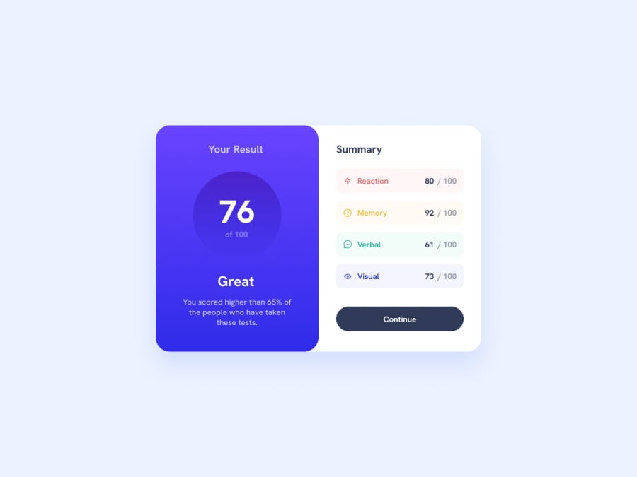
Design comparison
Solution retrospective
Hello, When I was building this project I met 2 issues:
- [FIXED] How to style site for mobile device, when I can't fold my page more than 440px wide?
- Is there a way to position paragraphs automatically with flexbox without using too much margin properties?
Feel free to check out my code and point out things I could do better, because I feel that I used too much code.
Thanks!
Community feedback
- @climb512Posted almost 2 years ago
Hello again,
As for your first question, if you are using the Chrome browser, hit <F12> to access the dev tools then Ctrl-Shift-M to show a mobile-device view. You can then show your page on any screen size.
Marked as helpful1@BBualdoPosted almost 2 years ago@climb512 You can check it now, I fixed the mobile device problem :)
0 - @climb512Posted almost 2 years ago
Your Desktop version looks great!
You ask about how to style the Mobile version, so I'll give you some general thoughts on how to proceed with a project like this where you know you want a different display on mobile:
There is a well-respected design pattern in web development called "Mobile First", which I try to apply to all my projects. It just means that you do the Mobile version first, with all the styling, and then put everything that you want to change for Desktop into a @media query. This is often much easier, because usually the desktop layout looks more complex, and it is often easier to add complexity in a @media query rather than take the complexity away inside that @media query.
So I see that now you have all your code inside @media (min-width: 376px) {}
This means that there is no stying at all below 376px, which is one problem, and also your desktop styling applies all the way down to 376px (some number like 600px might be more appropriate for a breakpoint on this project, just based on how the desktop sections start to crush together at 600px).
Please check out "Mobile-first" design, there are many videos and blog posts on the topic. It seems simple, but it made a big difference for me, especially in the speed at which I could develop a responsive project.
So, to be clear, most of the element styling (other than the overall split-panel layout) can apply to mobile and desktop too, so all of that can be OUTSIDE the @media (min-width:600px) {} along with any special mobile styling.
I hope this helps! Ted
Marked as helpful1@BBualdoPosted almost 2 years ago@climb512 Thank you very much! I'm gonna try this method out right now :D
0
Please log in to post a comment
Log in with GitHubJoin our Discord community
Join thousands of Frontend Mentor community members taking the challenges, sharing resources, helping each other, and chatting about all things front-end!
Join our Discord
