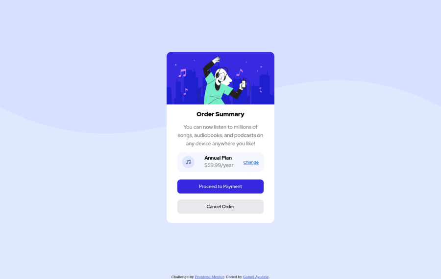
Design comparison
Solution retrospective
I will really appreciate any feedback and correction
Community feedback
- @SamadeenPosted over 2 years ago
Hey!! Cheers 🥂 on completing this challenge.. . Here are my suggestions 1.Set your background image to no-repeat 2. Set your background color to the hsl value provided. 3. Go down orderly when you are using the headings h1 down to h2 down to h3 and so on. 4. You can add margin-top to your card to push it down a little . Regardless you did amazing.. Happy coding!!!
Marked as helpful0@gamelayoPosted over 2 years ago@Samadeen Thanks for your suggestions, I had worked on it
0 - @denieldenPosted over 2 years ago
Hi Gamel, good job! I took some time to look at your code and have some ideas for improving it:
- add descriptive text in the
altattribute of the image - remove all unnecessary code, for example the
divcontainer of image - remove all
marginfrommaintag because with flex they are superfluous - use flexbox to the body for center the card
- add
transitionproperty on the buttons with hover effect - For fix the top image just put more specific background properties to the body:
background: url("../img/pattern-background-desktop.svg") no-repeat top center;
background-size: contain;
background-color: #e0e8ff;
Overall you did well 😉
Hope this help and happy coding!
0 - add descriptive text in the
Please log in to post a comment
Log in with GitHubJoin our Discord community
Join thousands of Frontend Mentor community members taking the challenges, sharing resources, helping each other, and chatting about all things front-end!
Join our Discord
