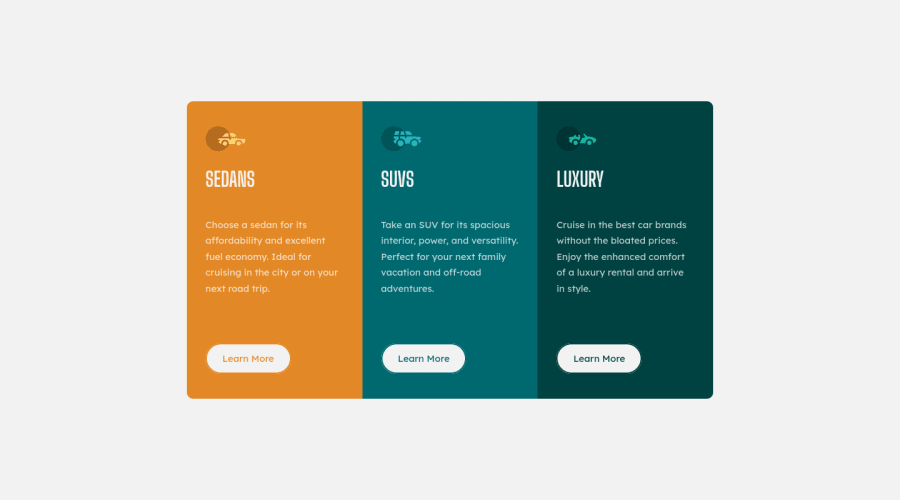
Design comparison
Solution retrospective
I did this challenge last year, now I took it up again to upload it and now that I have a little more knowledge I realize that I didn't do things so well, but it also helped me to see the progress. With this I only want to say that you should not be discouraged, practice and little by little you will see the progress.🦾🦾
Community feedback
- @PhoenixDev22Posted over 2 years ago
Hello Enmanuel Otero Montano ,
Congratulation on completing this challenge,
Excellent work! I have few suggestions regarding your solution:
*HTML
-
To tackle the accessibility issue: Page should contain
<h1>
. In this challenge , as it’s not a whole page , you may use<h1>
with theclass sr-only
which is visually hidden but present for assistive technology. -
In this challenge , all the images are decorative . For any decorative images, each img tag should have empty
alt=""
andaria-hidden="true"
attributes to make all web assistive technologies such as screen reader ignore those images .
And it is essential that interactive elements have
focus-visible
styles as well as hover styles. These need to be really clear and obvious as they are needed to help a keyboard user know where is focused on the page.CSS
-
border-radius
andoverflow hidden
to the main container that wraps the three cards so you don't have to set it to individual corners. -
Consider using rem for font size . If your web content font sizes are set in absolute units, such as pixels, the user will not be able to re-size the text or control the font size based on their needs. Relative units “stretch” according to the screen size and/or user’s preferred font size, and work on a large range of devices.
Last the more you practice, the more you learn and improve. Overall, your solution is great. hopefully this feedback helps.
Marked as helpful0@Enmanuel-Otero-MontanoPosted over 2 years ago@PhoenixDev22 Hello PhoenexDev22! I agree with you on some points, others I don't.
-
About the h1. As you say exactly, this challenge is a part of a page, that's why I decided not to put the h1 and on the other hand I don't use boostrap.
-
As for the images, they may or may not be decorative, that depends, I did not take them as decorative. On the other hand, what you say about the alt is completely correct, but in my case I did not implement it that way because of the above.
-
I didn't fully understand the interactive elements with focus. I tried to get as close as possible to the design. I would appreciate if you could make me understand what you wanted to tell me at this point.
-
Regarding the points you mention about the CSS, you are absolutely right, but as I already said in the explanation of the challenge, I had done this since last year and only now I corrected some things quickly. I invite you to see my most recent challenges so you can see that I no longer put the font size in px, now I use rem or em.
I thank you from the bottom of my heart for reviewing my solution and making these suggestions, as it is not only useful for me, but also for other people who may see this solution. Feel free to write to me. You seem to have a lot of knowledge.
0@PhoenixDev22Posted over 2 years ago@Enmanuel-Otero-Montano
I apologize for the late response. Glad it was helpful.
What I meant is adding
:focus-visible
styling to all anchor tags in this case. Typically an outline goes around (outside) the visible boundary of the component. You can use the Tab key to move through each interactive element on a page(<a>
) (Many browsers show a "focus ring" by default). However, focus indicators look different across browsers. If you want your website to have a consistent look and feel across multiple browsers, it would be worth investing the time to define focus styles.- You may want to have a look at Grace snow’s solution who is an accessibility expert.
It happens quite often that the reviewer learns new things in the process of performing the code review(especially when you come across new ways ) and also reinforce the obtained knowledge. So it’s just rewarding on both sides.
-
You may like to read here in W3.org
-
Also , another article: Give Your Site Some Focus! Tips for Designing Useful and Usable Focus Indicators
Hopefully this make it clear.
Marked as helpful0 -
Please log in to post a comment
Log in with GitHubJoin our Discord community
Join thousands of Frontend Mentor community members taking the challenges, sharing resources, helping each other, and chatting about all things front-end!
Join our Discord