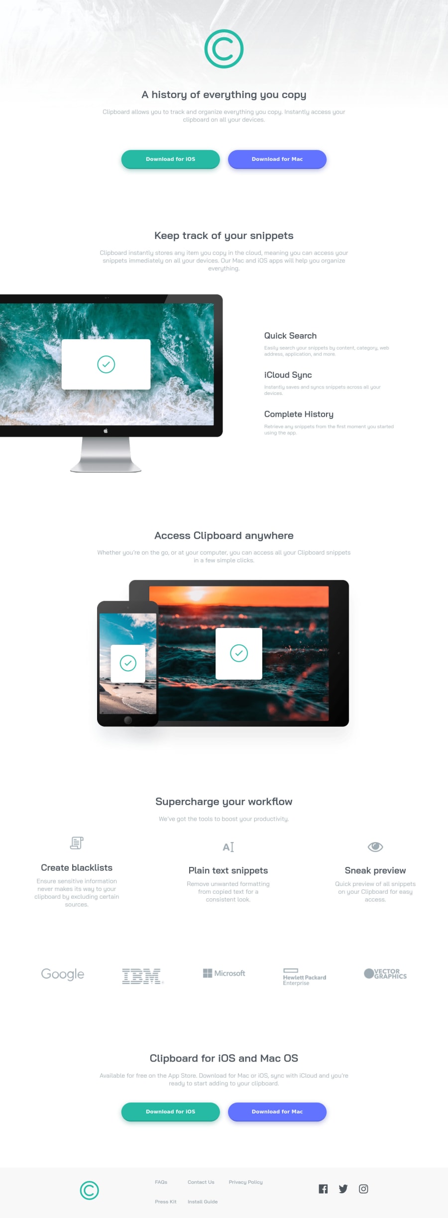
Design comparison
SolutionDesign
Solution retrospective
Please feel free to comment on my mistakes and your opinions
Community feedback
- @Dinesh1042Posted over 3 years ago
Hi, Wack04 Fantastic work on this challenge
Here are my few suggestions
- Consider using only one
h1tag as the top-level-heading only. The h1 tag is the most important heading because it’s the highest level tag that shows what your specific page is about. - The presence of more than one H1 won’t necessarily confuse the search engine, but it could dilute the SEO power of a single H1.
- responsiveness of the site is great
- Add
:focuspseudo class to interactive elements like anchors, buttons, etc. Use outline property to make your website more accessible to keyboard users. Focusable elements like anchor, buttons, or inputs they have applied default :focus pseudo class with outline property. These default styles are subtle and hardly visible tho. Furthermore, every browser has a slightly different default style for the outline, so you probably want to change the default style.
Great work Happy Coding and keep coding
0 - Consider using only one
Please log in to post a comment
Log in with GitHubJoin our Discord community
Join thousands of Frontend Mentor community members taking the challenges, sharing resources, helping each other, and chatting about all things front-end!
Join our Discord
