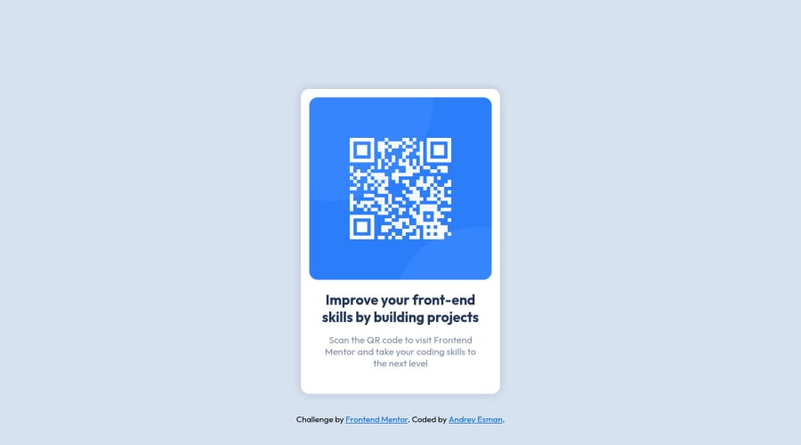
Design comparison
Community feedback
- @correlucasPosted over 2 years ago
👾Hello @Andy-Esm, Congratulations on completing this challenge!
Great code and great solution! I’ve few suggestions for you that you can consider adding to your code:
Your solution is great and the code is working, but the HTML structure can be reduced by removing unnecessary divs, all you need is a single
<main>or<div>to keep all the content inside, and nothing more. The ideal structure is thedivand only the image, heading, and paragraph.Here’s one example to show can be cleaner this HTML structure:
<body>
<main>
<img src="./images/image-qr-code.png" alt="QR Code Frontend Mentor" >
 <h1>Improve your front-end skills by building projects</h1>
<p>Scan the QR code to visit Frontend Mentor and take your coding skills to the next level</p>
</main>
</body>
To reduce the CSS you can use the direct selector for each element instead of using
classthis way you have a code even cleaner, for example, you can select everything using the direct selector for (img, h1, and p, main).✌️ I hope this helps you and happy coding!
Marked as helpful0 - Account deleted
Hey @Andy-Esm, some suggestions to improve you code:
- To give you HTML code structure, you want to set up your code in the following manner (only did parent containers):
  <body>
    <main>
      <article class="card-container”>
      </article>
    </main>
  </body>
The Main Element identifies the main content of the document.
While the Article Element will serve as the card’s container, because the card represents a complete, or self-contained, section of content that is, in principle, independently reusable.
More info:
https://web.dev/learn/html/headings-and-sections/
- Updated the following to make your image responsive and remove unnecessary code:
.card {
	max-width: 36rem;
	padding: 1.5rem;

}
.card__img {
    width: 100%;
    border-radius: 1.5rem;
}
Happy Coding! 👻🎃
Marked as helpful0 - @MelvinAguilarPosted over 2 years ago
Hi @Andy-Esm, good job for completing this challenge! 👋
Here are some suggestions to improve your code:
-
Don't use
<br>, the<br>tag is not semantic. It should never be used to add vertical spacing, it is only used in specific cases (e.g. poem or an address) also when a screen-reader reads the text it will break the text at the <br /> tag and break the flow of reading, You could use padding or margin styling via CSS to avoid them. More Information here. -
Update the image to make it a bit responsive:
.card__image { width: 100%; object-fit: contain; }- Add margin: 10px; to the main selector
I hope those tips will help you.
Good Job !
Marked as helpful0@Andy-EsmPosted over 2 years ago@MelvinAguilar Thank you! I know it but couldn't figure out how to format text like in design.
1@MelvinAguilarPosted over 2 years ago@Andy-Esm You could remove the <br> elements and update the margin of the
.card__text-descrselector, so you would have the text as you have it now, but without using<br>.card__text-descr { /* . . . */ margin: 0 1.5rem 3rem 1.5rem; }Marked as helpful0 -
Please log in to post a comment
Log in with GitHubJoin our Discord community
Join thousands of Frontend Mentor community members taking the challenges, sharing resources, helping each other, and chatting about all things front-end!
Join our Discord
