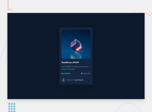
Design comparison
Solution retrospective
Hi everybody! This is my attempt to recreate the NFT card component. I know I most likely have an excess of CSS repeated througout the stylesheet. Learned a lot about positioning and relying on Chrome's dev-tools to get a better understanding on how the items are laid out. I want to better understand Media Queries I'm looking to optimize them for the next project. Hope to keep learning and getting a better grip of the basics before adding more to my study load.
I would appreciate any and all feedback!
Thank you
Community feedback
- @BikeInManPosted almost 3 years ago
Hi Hernan,
Great work there.
I think, you left out one thing.
In the design, text next to the icons(ETH and Clock) appear to be centered at the center of the icon.
I too had tough time solving this, so I used a flexbox for that row and centered them with align-items.
I am beginner and attempted the same exercise and I too am now seeking feedback.
Good luck, and Happy new year. @bikeinman
0
Please log in to post a comment
Log in with GitHubJoin our Discord community
Join thousands of Frontend Mentor community members taking the challenges, sharing resources, helping each other, and chatting about all things front-end!
Join our Discord
