Design comparison
SolutionDesign
Solution retrospective
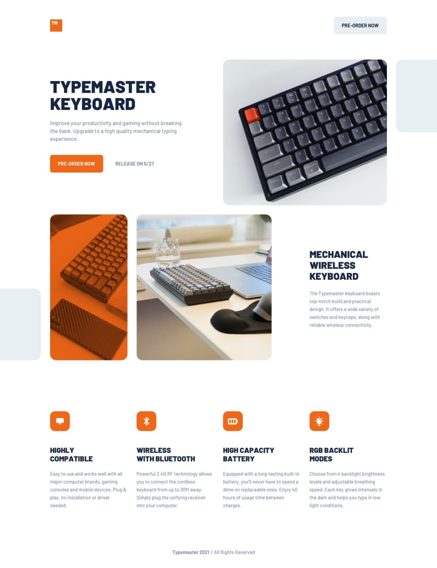
That was quite a challenge! Especially, with the image adjusting. I decided to use background images instead of <img>. I will appreciate any feedback you can give me.
Community feedback
- @HeitoluisPosted over 3 years ago
Thanks for your feedback @AgataLiberska! Also, you're right! it would make more sense to have rounded corners like the rest of the images. =)
0 - @AgataLiberskaPosted over 3 years ago
Hi @Heitoluis, your solution looks great! Although I think the image in the top section would look better if it had all corners rounded, like other images :)
0
Please log in to post a comment
Log in with GitHubJoin our Discord community
Join thousands of Frontend Mentor community members taking the challenges, sharing resources, helping each other, and chatting about all things front-end!
Join our Discord
