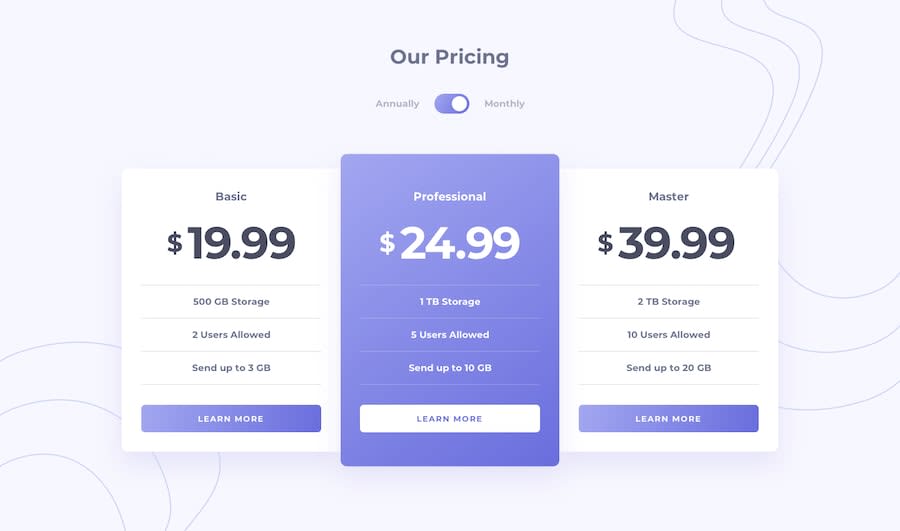
Design comparison
SolutionDesign
Solution retrospective
Your feedback will be very valuable! Thanks!
Community feedback
- @tedikoPosted over 3 years ago
Hello, Héctor Vásquez! 👋
Well done! Your solution looks nice and responds well. What I can suggest is:
- Add
:focuspseudo class to interactive elements like anchors, buttons etc. Useoutlineproperty to make your website more accessible to keyboard users. You did that forinputso good job, but others element also needs that. - Instead of using div for
.toggle-switchyou should use button.
Good luck with that, have fun coding! 💪
0 - Add
Please log in to post a comment
Log in with GitHubJoin our Discord community
Join thousands of Frontend Mentor community members taking the challenges, sharing resources, helping each other, and chatting about all things front-end!
Join our Discord
