Design comparison
SolutionDesign
Community feedback
- @PresidentTreePosted about 3 years ago
HTML
- Just as a note, you @import-ed your google font instead of linking it on your HTML file. I don't know if one is better than the other, but linking the google font is much more common. To see how to do it, the google font usually has a copy-and-paste function on the website.
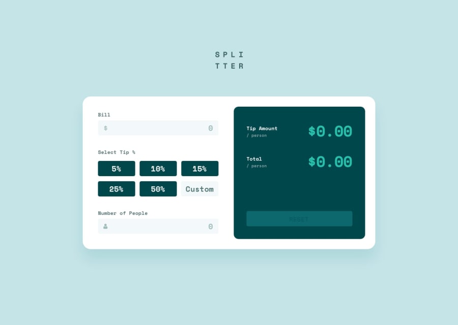
- The challenge came with an image of the "Splitter" logo already split, so you did not need to make a header for it. To use the image with the
imgtag, upload the image to GitHub and then open the image in a new tab to get the link. - Instead of making divs with classes for the percent tip, you could have just used the
buttontag.
CSS
- The challenge came with all the colors that you would need along with a visual reference for what the tip calculator should look like. Of course, it is up to you to decide what you want to do with it, but you obviously used some colors in the wrong places if your goal was to copy it. For example, the background color of the site should be
#C5E4E7instead of#9FE8DF. If you do not like coloring in HSL, there are places on the internet that allow you to input a color in any format and have it represent it in other formats, such as W3School's Color Picker. There's also the option to pull colors straight from an image using sites like Image Color Picker - For input and buttons, font does not translate as well as regular elements. As such, the easiest way to fix this is to include
font-family: inheritwhich would allow the fonts to always match whatever the parent element is. It is also helpful to includeoutline: noneto these elements since the outline is square by default and the elements are not square.
Marked as helpful0
Please log in to post a comment
Log in with GitHubJoin our Discord community
Join thousands of Frontend Mentor community members taking the challenges, sharing resources, helping each other, and chatting about all things front-end!
Join our Discord
