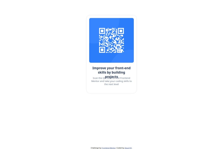
Design comparison
Solution retrospective
I feel that my interface is quite complete and similar to the Figma design.
What challenges did you encounter, and how did you overcome them?At first, I had some difficulty reviewing old CSS knowledge, but it didn’t take too long for me to overcome it.
What specific areas of your project would you like help with?I look forward to receiving feedback, evaluations, and suggestions on what I need to improve.
Community feedback
- @ZxjklpPosted about 2 months ago
Great job on completing the QR code component challenge on Frontend Mentor!
Semantic HTML
- Strengths: The code uses some semantic HTML elements like
<head>
,<body>
, and<div>
. - Improvements: Consider using more semantic elements such as
<main>
and<footer>
to improve the structure and accessibility of the document. For example, thecontainer
div could be a<main>
element.
Accessibility
- Strengths: The use of
alt
attribute for the image is good for accessibility. - Improvements:
- The text inside the
alt
attribute must say where it leads. - Ensure that the text inside the
div
elements is accessible by using appropriate heading tags like<h1>
,<h2>
, etc., instead of<div>
. - The
attribution
section could be wrapped in a<footer>
element to better indicate its purpose.
- The text inside the
Layout and Responsiveness
- Strengths: The use of Flexbox for layout is a good choice for creating a responsive design.
- Improvements:
- The
width
andheight
properties set in pixels could be converted to relative units like percentages orrem
to make the layout more responsive.
- The
Code Structure, Readability, and Reusability
- Strengths: The code is relatively well-structured and uses classes to apply styles.
- Improvements:
- Avoid inline styles within the
style
tag in the HTML. Instead, move the styles to an external CSS file for better maintainability.- Use lowercase for HTML tags and attributes to maintain consistency and readability (e.g.,
div
instead ofDiv
).
- Use lowercase for HTML tags and attributes to maintain consistency and readability (e.g.,
Design Consistency
- Strengths: The design seems to follow the challenge requirements.
- Improvements:
- Ensure that the design matches the provided design specifications in terms of spacing, font-family, and color.
Marked as helpful1 - Strengths: The code uses some semantic HTML elements like
- @MikDra1Posted about 2 months ago
I encourage you to use this technique to make the card responsive with ease:
.card { width: 90%; max-width: 37.5rem; }
On the smaller screens card will be 90% of the parent (here body), but as soon as the card will be 37.5rem (600px) it will lock with this size.
Also to put the card in the center I advise you to use this code snippet:
.container { display: grid; place-items: center; }
Hope you found this comment helpful 💗💗💗
Good job and keep going 😁😊😉
Marked as helpful0 - @Davzp1980Posted about 2 months ago
Включает решение семантический HTML Улучшений не требуется Макет хорошо выглядит на разных размерах экрана
0
Please log in to post a comment
Log in with GitHubJoin our Discord community
Join thousands of Frontend Mentor community members taking the challenges, sharing resources, helping each other, and chatting about all things front-end!
Join our Discord