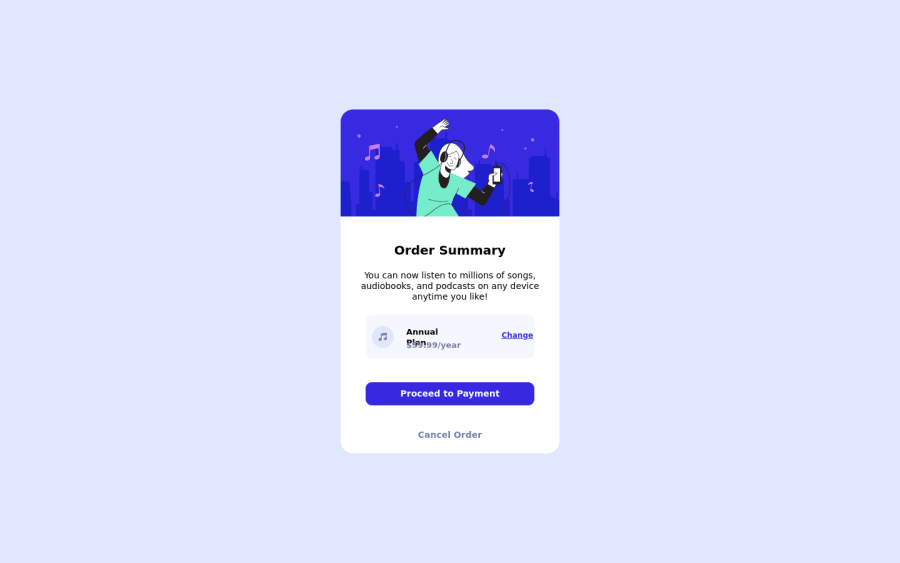
Design comparison
SolutionDesign
Community feedback
- @denieldenPosted over 2 years ago
Hi Riddhidipta, good job! I took some time to look at your code and have some ideas for improving it:
- add
maintag and wrap the card for improve the Accessibility imgelement must have analtattribute, it's very important!- if you write the
widthattribute in theimgtag you don't have to specify thepxsize, just the number - remove all unnecessary code, the less you write the better as well as being clearer: for example the
divcontainer of image - the
<br>is for break the text not to divide elements - use
h1and notdivfor the title of card - use semantic html like
buttonfor the payment button - add a little
transitionon the element with hover effect - instead of using
pxtry to use relative units of measurement -> read here - for add the top image in the background just put more specific background properties to the body:
background: url("../img/pattern-background-desktop.svg") no-repeat top center;
background-size: contain;
background-color: #e0e8ff;
Overall you did well 😉
Hope this help and happy coding!
Marked as helpful0@CodingLife1024Posted over 2 years ago@denielden Thank you for your feedback. Could you suggest some good free resources for learning javascript? Thanking you Riddhidipta
1@denieldenPosted over 2 years ago@CoderBoi1024 You are welcome! Sure, follow the links:
Marked as helpful0 - add
Please log in to post a comment
Log in with GitHubJoin our Discord community
Join thousands of Frontend Mentor community members taking the challenges, sharing resources, helping each other, and chatting about all things front-end!
Join our Discord
