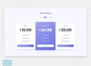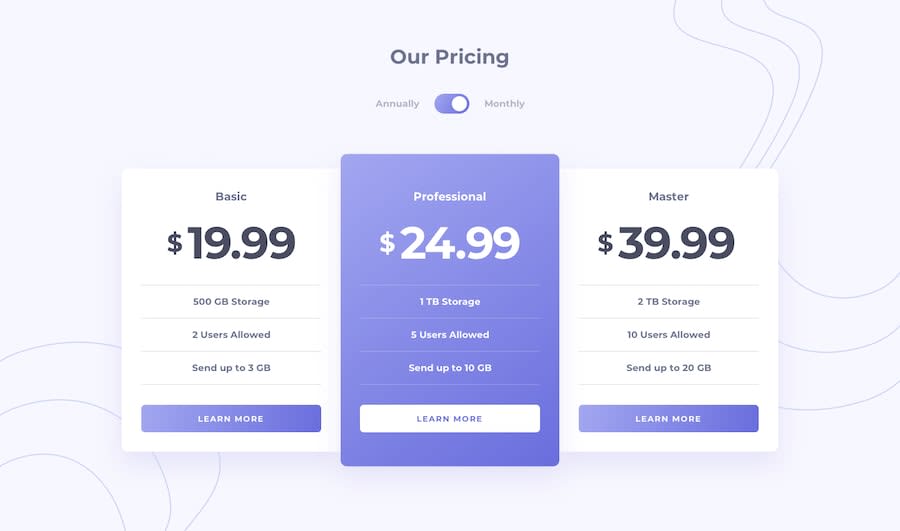
Design comparison
SolutionDesign
Solution retrospective
I'm pretty sure there are better ways than the way I did it, so pleas point my weaknesses out so that I can work on them.
Community feedback
- @lailton-bPosted almost 5 years ago
Great job, Nabil, I really enjoyed it!! Just a tip: you could make the content occupy 100% of the screen on the desktop by adding height: 100vh in the html. This property will always calculate the maximum height of the screen and distribute correctly, it gives a better appearance!
2 - @mattstuddertPosted almost 5 years ago
You've done a really good job! The only thing I'd really change in your HTML would be to use a
ulfor the feature lists instead ofh3elements. Keep up the great work!1
Please log in to post a comment
Log in with GitHubJoin our Discord community
Join thousands of Frontend Mentor community members taking the challenges, sharing resources, helping each other, and chatting about all things front-end!
Join our Discord
