Design comparison
SolutionDesign
Community feedback
- @catherineisonlinePosted about 2 years ago
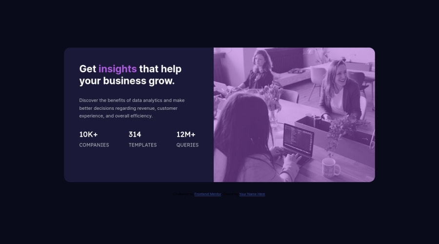
For the image, I did something like this, I hope that helps:
            <div class="image-container">
                <img class="main-image" src="images/image-header-mobile.jpg" alt="">
            </div>

.image-container {
  display: inherit;
  position: relative;
  width: 100%;
  border-radius: 0 10px 10px 0;
  background-color: hsl(277, 64%, 61%);
}
.main-image {
  width: 100%;
  height: 100%;
  position: relative;
  background-size: cover;
  border-radius: 0 10px 10px 0;
  mix-blend-mode: multiply;
  opacity: 0.75;
}
Marked as helpful0 - @VCaramesPosted about 2 years ago
Hey there! 👋 Here are some suggestions to help improve your code:
- The statistics at the bottom **are a list **, so it should be built using an
unordered Listelement.
More Info:📚
MDN <ul>: The Unordered List element
- Along with a blank
alt tagyour “image” should also have aaria-hidden=“true”to fully hide it from assistive technology.
More Info:📚
https://www.w3.org/WAI/tutorials/images/
- This challenges requires the use of two images 🎑 for different breakpoints. The
pictureelement will facilitate this.
Here is an example of how it works: EXAMPLE
Syntax:
  <picture>
    <source media="(min-width: )" srcset="">
    <img src="" alt="">
  </picture>
More Info:📚
https://www.w3schools.com/html/html_images_picture.asp
- To get the image to look like the FEM example, you are going to want to use the
mix-blend-modealong with themultiplyvalue and include aopacitywith the value of 0.8.
Code:
img {
  opacity: 0.8;
  mix-blend-mode: multiply;
}
If you have any questions or need further clarification, feel free to reach out to me.
Happy Coding!🎄🎁
Marked as helpful0 - The statistics at the bottom **are a list **, so it should be built using an
Please log in to post a comment
Log in with GitHubJoin our Discord community
Join thousands of Frontend Mentor community members taking the challenges, sharing resources, helping each other, and chatting about all things front-end!
Join our Discord
