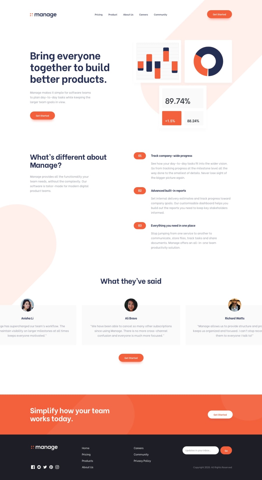
Design comparison
Solution retrospective
This is the second challenge I managed to finish at Frontend Mentors. I did not get feedback on my first one and hope to get as many as possible this time around. So please leave your comments and suggestions. I very much appreciate it.
Community feedback
- @ACdev27Posted over 3 years ago
In the What We've Said section, on a desktop screen I see quotes from 4 people, but in tablet or phone size screen the quotes just go off-screen so I only see two of the quotes, or one quote on phone size screen.
I think you need to use some responsive design to have this content adjust to the screen size. For example, for tablet screen it might be 2 rows of 2 quotes in a row, or on a phone screen, just one column of quotes.
I have not done this challenge. But I guess another option is if you made it so someone can swipe left and right on this content to reveal the quotes that are off-screen.
0@BelayAdamuPosted over 3 years ago@ACdev27 Thank you very much for the feedback, my friend. Actually, the page is responsive. the testimonial section is scrollable on tablets and phones. I just haven't implemented some js code to allow that on desktops. But, yeah! that is definitely something I should rectify. I was just so impatient.
0
Please log in to post a comment
Log in with GitHubJoin our Discord community
Join thousands of Frontend Mentor community members taking the challenges, sharing resources, helping each other, and chatting about all things front-end!
Join our Discord
