Design comparison
SolutionDesign
Community feedback
- P@RetroApePosted 5 months ago
Hi Maryam.
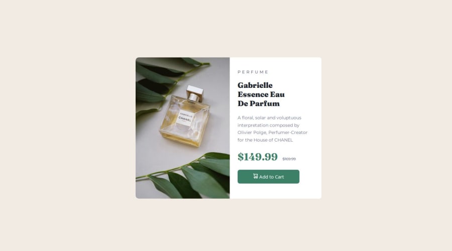
You did good job with the overall layout; mobile layout is much better than the desktop one. The colors are on spot.
Things I can help you with:
- I noticed that the image doesn't completely touch the bottom of the card. I had a lot of problems with that, but I just couldn't figure out why is it happening no matter what I tried.
- In the end I measured the height of the card in the design and wrote it directly:
28.125rem(it is different for the mobile)
- In the end I measured the height of the card in the design and wrote it directly:
- When I try resizing the window, the width of the card changes. The width should stay in place (except for the transition for mobile). The width of the card should be
37.5rem(it is different for the mobile) - And the best thing I can help you with... I noticed that the image is going over the card. The card is therefore not showing its rounded angles on the left side. The solution is easy. Just add
overflow: hidden;for the.cardelement.
I hope I managed to help you a little bit :)
Best of Luck!
Marked as helpful0@MARYAMTEEPosted 5 months ago@RetroApe Thank you for your recommendations! They're incredibly helpful in improving my work. I appreciate you taking the time to share your insights. It made a noticeable difference
0 - I noticed that the image doesn't completely touch the bottom of the card. I had a lot of problems with that, but I just couldn't figure out why is it happening no matter what I tried.
Please log in to post a comment
Log in with GitHubJoin our Discord community
Join thousands of Frontend Mentor community members taking the challenges, sharing resources, helping each other, and chatting about all things front-end!
Join our Discord
