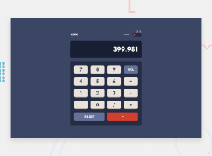
Design comparison
Solution retrospective
Wow, this was a really nice project which changed my way of writing codes a little. Please i need a feedback about my project, and on what areas i should improve. Thanks.
Community feedback
- @soransh-singhPosted about 3 years ago
It looks great you have done great job....
I think you should at to add
margin-rightin classoutputand alsoborder-radiusin classoutputandbutton-containersand you have implemented the calculator logic nicely
it will be more fun if you will add support for calculating negative numbers also if divide .6 by 3(.6/3) you will get a .19999999998 ... you can round off number to certain digits so it doesn't show too much 9's
Marked as helpful1@Eugene44-hubPosted about 3 years ago@soransh-singh Thanks very much for the feedback. i will make the adjustments. I really appreciate ☺️☺️
1
Please log in to post a comment
Log in with GitHubJoin our Discord community
Join thousands of Frontend Mentor community members taking the challenges, sharing resources, helping each other, and chatting about all things front-end!
Join our Discord
