Solution retrospective
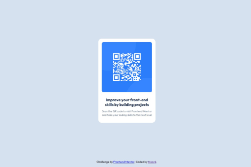
I'm proud of completing this project and making it look similar to the design and using the figma file as ra eference to more details. Next time I would like to try using a framework like React or Svelte, and maybe create a root pseudo-class for making unique CSS variables.
What challenges did you encounter, and how did you overcome them?My challenge was mainly with github and deploying the websitelol
What specific areas of your project would you like help with?I would like help with using more efficient techniques of styling, especially positioning and sizing. I would really like to learn the best practices for things such as centering "cards" and making them repsonsive when the screen size changes.
Please log in to post a comment
Log in with GitHubCommunity feedback
No feedback yet. Be the first to give feedback on moonji-spoonji's solution.
Join our Discord community
Join thousands of Frontend Mentor community members taking the challenges, sharing resources, helping each other, and chatting about all things front-end!
Join our Discord