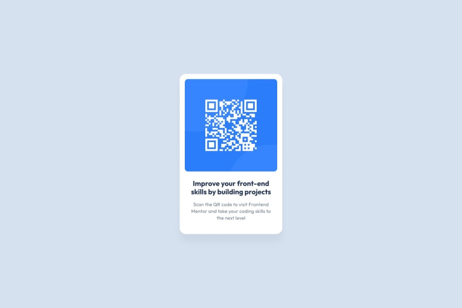
Design comparison
Solution retrospective
I had trouble making the site live, I wasn't familiar with github and it was my first setting up a live site, the guides helped a lot though.
Community feedback
- @Ozzy-codesPosted over 1 year ago
Hi C-a-s-t-e-l,
Congrats on completing this project!
Accessibility report flags
Found some material on W3 School that may help to introduce landmarks. I also found a brief video of landmarks by a11y -101 that helps to understand its utility.
Sizing elements
I recently got some feedback on the use of px’s in sizing elements by @visualdenniss and wish to extend that advice to your code. Per ChatGPT -
“It's generally recommended to avoid using pixels (px) for sizing elements that can affect website responsiveness and accessibility, such as font sizes, margins, and padding. However, there may be cases where pixels are appropriate, such as for images or fixed-width elements.
The main issue with using pixels is that they are an absolute unit, meaning they do not scale proportionally with changes in screen size or font size. This can make it more difficult for users who rely on assistive technology or who have visual impairments to read and navigate the website.
Relative units such as rem and em, on the other hand, are scalable and responsive to changes in font size, making them more accessible and responsive for all users. So while it may not be necessary to avoid using pixels altogether, it's generally best practice to use relative units whenever possible.”
Another accessibility best practice
On your
<img>element - I recommend including in thealt=“”attribute, text describing your image. Note - I’d avoid capitalized text as screen readers typically read capitalized words by each individual letter e.g. QR CODE -> “Q-R C-O-D-E”.For more feedback, I would appreciate learning more about your design approach via a README. 😁
Marked as helpful2@visualdennissPosted over 1 year ago@Ozzy-codes Happy to hear that it was useful! Nice suggestions as well!
@C-a-s-t-e-l, nice work with the card! I think you have the header twice, there is one above the attributions, so you might wanna remove that as well. The paragraphs and title inside the box needs some little paddings, so it would be better to have padding applied to the box instead of the image (margin: 10px) so it is a bit more globally scoped.
Hope you find this feedback helpful!
Marked as helpful1
Please log in to post a comment
Log in with GitHubJoin our Discord community
Join thousands of Frontend Mentor community members taking the challenges, sharing resources, helping each other, and chatting about all things front-end!
Join our Discord
