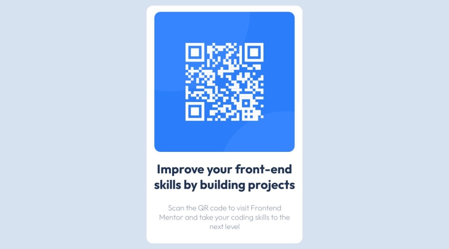
Design comparison
Solution retrospective
I'm having a problem with responsiveness, scrolling is happening and the image is leaking. Any help and feedback are welcome.
Community feedback
- @danielmrz-devPosted 12 months ago
Hey Natalia! Your project looks great!
Here's a few tips on how you can improve it:
You can place the card in the middle of the page and make it fit inside the screen (without vertical scrollbar), do this:
You set "height: 100vh;" inside the container. This makes your container occupy 100% of the vertical screen. To solve it, you can remove the height property from your main container. You already set this same property on the body, so it's not necessary.
On the body, you can add: display: flex; align-items: center; justify-content: center;
This will place your card exaclty in the middle of the page.
Hope it helps!
Marked as helpful0 - @jvssvjPosted 12 months ago
Hello, the problem is with the width. You are setting the fixed width ex.(width: 450px;) instead of ex.(max-width: 450px;). ex:
main {
    width:100%
    max-width: 500px;
}
This applies to all your code. Good luck 😊
Marked as helpful0 - @ivansgarciaPosted 12 months ago
I think that the problem is padding in the p element, it increases the height. And adding padding in the body and removing box-sizing gives more accurate result. I hope this results helpful.
Marked as helpful0
Please log in to post a comment
Log in with GitHubJoin our Discord community
Join thousands of Frontend Mentor community members taking the challenges, sharing resources, helping each other, and chatting about all things front-end!
Join our Discord
