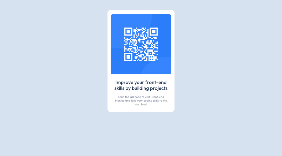
Design comparison
SolutionDesign
Please log in to post a comment
Log in with GitHubCommunity feedback
- @benjaminbilgehan
nice job buddy!
here are some tips inside the body add
height:100vh;so it can center the card in the middle of the box. When you use flex you have to give a height of 100vh so flex can center the div element in the middle of the screen along with your code.body { display: flex; justify-content: center; align-items: center; font-family: Outfit; background-color: hsl(212, 45%, 89%); height:100vh; /* I added this line of code here. to make it centered*/ }Marked as helpful
Join our Discord community
Join thousands of Frontend Mentor community members taking the challenges, sharing resources, helping each other, and chatting about all things front-end!
Join our Discord
