Design comparison
SolutionDesign
Solution retrospective
What did I miss? Please tell me.
Please log in to post a comment
Log in with GitHubCommunity feedback
- @shainay
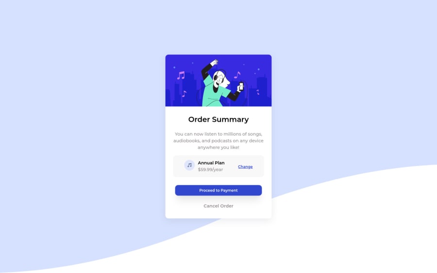
You didn't change the color of a background. And max-height in body tag. The music icon in come to left side a little bit, use justify-content: space-between for that. You didn't put background image properly too. Font also you use different one, the one is give in style-guides in Red Hat Display.
Marked as helpful
Join our Discord community
Join thousands of Frontend Mentor community members taking the challenges, sharing resources, helping each other, and chatting about all things front-end!
Join our Discord
