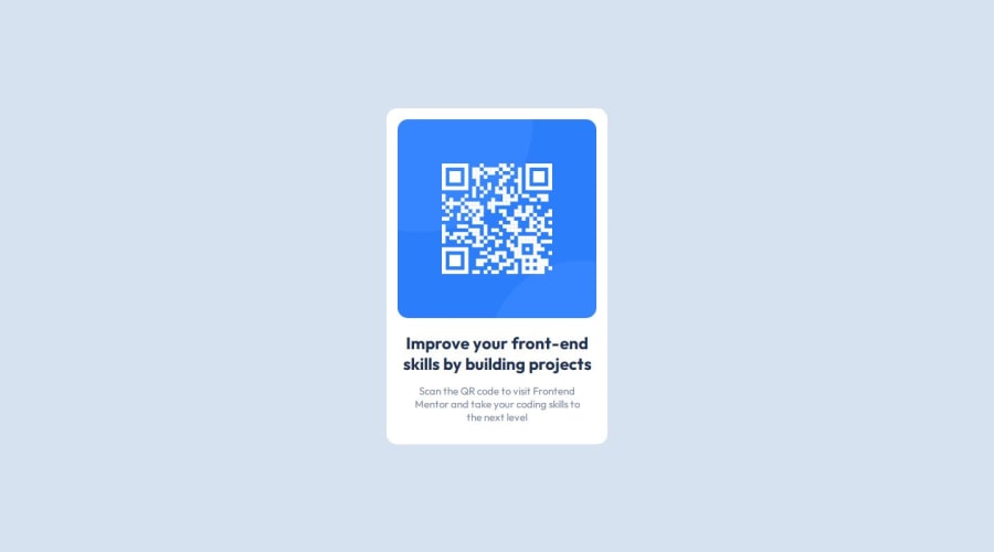
Design comparison
Solution retrospective
I'm proud of myself to keep going and find a solution even in small projects like this one, because I'm trying to escape tutorial hell I fell into and finally see how much do I need to do to change theory into practice.
What challenges did you encounter, and how did you overcome them?Escaping tutorial hell and trying to finally put some practice
What specific areas of your project would you like help with?I think that mobile version looks kinda okay but I'm not sure about that.
Community feedback
- @kennykage101Posted 11 months ago
Congrats! Your solution was impressive The HTML layout is perfect and it contains semantic HTML It is accessible and the layout looks good on different screen sizes. The HTML code is well structured and split into main, sections making it accessible. Although the design differs a bit from the solution. The height of the box is not the same as that of the solution You can check for the height of the box in the Figma design file and readjust it or if you don't know how to do that you can use trial and error to get the perfect height of the box. Thanks
Marked as helpful0
Please log in to post a comment
Log in with GitHubJoin our Discord community
Join thousands of Frontend Mentor community members taking the challenges, sharing resources, helping each other, and chatting about all things front-end!
Join our Discord
