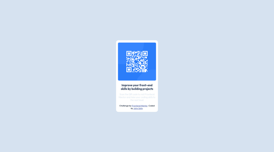
Design comparison
Solution retrospective
The project wasn't difficult, but it is just the beginning. I cant wait to take on the next challenge. Do you have any recommendation on my naming and tag convention?
Community feedback
- @PhoenixDev22Posted over 2 years ago
Hello John Soto,
Congratulation on completing this challenge. your solution looks great. You have received already some incredible feedback .I have some suggestions regarding your solution if you don’t mind:
-
First of all, I suggest to have the styles in a separate file.
-
Use the
<main>
landmark to wrap the card, and<footer>
for the attribution. HTML5 landmark elements are used to improve navigation experience on your site for users of assistive technology.` -
The alternate text should be present in that image as it’s an important content (informative image). And it should tells the users where it takes : like
Qr code to frontend mentor
CSS:
width: 22rem;
an explicit width is not a good way. consider usingmax-width
to the card instead.- consider giving the
<body>
,min-height: 100vh ;
instead ofheight: 100%
, this will let the body grows taller if the content outgrows the visible page.
.card-container { min-height: 100vh; display: flex; justify-content: center; align-items: center; text-align: center; background-color: hsl(212, 45%, 89%); } .card { max-width: 22rem; display: flex; flex-direction: column; align-items: center; /* margin: auto; */ background-color: hsl(0, 0%, 100%); padding: 1.2rem; border-radius: 12px; }
Aside these , Good work! Hopefully this feedback helps
Marked as helpful1 -
- Account deleted
Nice work here!
Change line 86 <div class="card"> to <main class="card"></main> and line 96 <div class="attribution"> to <footer class="attribution"></footer>, as these will curb repetition of div tag.
learn to use :root {} in your css to hold variables and try to always comment your work both the html and the css as this will make code review easy. You will appreciate this when you embark on bigger project.
If you found any of these helpful, give it a like.
Happy Coding!
Marked as helpful1
Please log in to post a comment
Log in with GitHubJoin our Discord community
Join thousands of Frontend Mentor community members taking the challenges, sharing resources, helping each other, and chatting about all things front-end!
Join our Discord