Design comparison
Solution retrospective
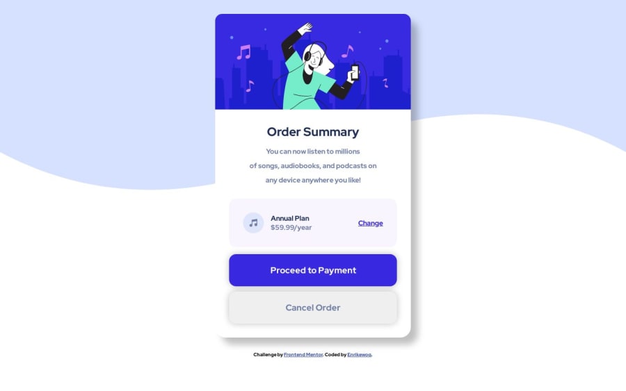
Hello!, good people... How do i apply a certain height/width so it matches with the solution image but without make it too big for mobile users? or too small for desktop users... (Should i even use a certain Height/Width?) or should i have had use any kind of shrink property that shrinks at different screen sizes that i dk off? And how do i vertically center it? i thought it was centered but is not T -T
Community feedback
- @MelvinAguilarPosted about 1 year ago
Hello there ๐. Good job on completing the challenge !
-
Without the original Figma design, it's challenging to determine the exact width and height values. What you could do, and what I often do, is use a browser extension like Pixel Perfect to overlay the design on the solution and try to match the dimensions.
To center it vertically, you need to set a height for the container where you apply flexbox. Without a height, there's no reference point for vertical alignment. I noticed you're centering in the
main
, but the height is on thebody
.A solution would be to add
min-height: 100vh
to the main* element and move the padding from the body to the main element.Another solution is to transfer all the centering styles from the main element to the body element.
I hope you find it useful! ๐
Happy coding!
Marked as helpful1@EnrikewoqPosted about 1 year agoThanks! im cheking aut about that browser extension you mention, its going to be helpfull, i just updated the code thanks!@MelvinAguilar
1 -
Please log in to post a comment
Log in with GitHubJoin our Discord community
Join thousands of Frontend Mentor community members taking the challenges, sharing resources, helping each other, and chatting about all things front-end!
Join our Discord