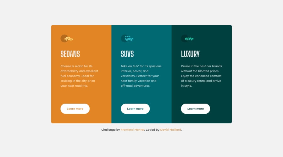
Design comparison
Solution retrospective
Hey :)
I have done with challenge with Flexbox. I would love to have any constructive comment :)
Community feedback
- @ApplePieGiraffePosted almost 4 years ago
Hi there, David Maillard! 👋
Good work on this challenge! 👍 Your solution looks great and responds well! 👏
I just noticed that the card component is a tad bit wide when the layout first switches from desktop to mobile—you might want to add a max-width to the card so that it isn't too wide when the layout first changes. 😉
Keep coding (and happy coding, too)! 😁
0 - @vanzasetiaPosted almost 4 years ago
👋Hi David Maillard!
🎉 Awesome!!! This one is also mobile friendly 👍 and responsive 👐.
🔥🔥Keep Going!🔥🔥
0
Please log in to post a comment
Log in with GitHubJoin our Discord community
Join thousands of Frontend Mentor community members taking the challenges, sharing resources, helping each other, and chatting about all things front-end!
Join our Discord
