Design comparison
SolutionDesign
Community feedback
- @grace-snowPosted 10 months ago
Hi
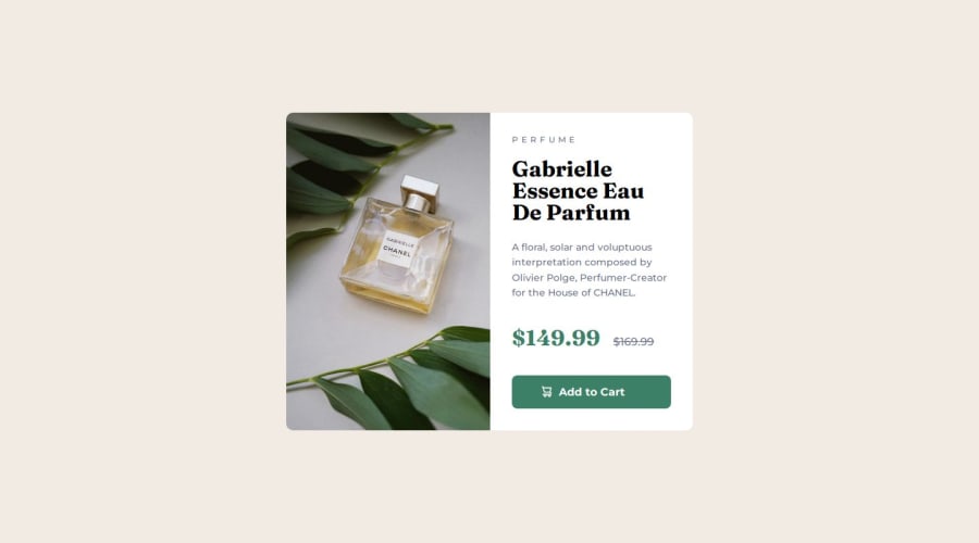
You're misusing article and section in this, must have the images in the html not background (very important content), and have several other issues in the html. I recommend you read the post on how to plan html on FEDmentor.dev
Note it is better for performance to link fonts in the html head instead of css imports.
You really should be styling mobile first in these challenges. Those should be the default styles, then only change the properties you need to for larger screens.
Marked as helpful0
Please log in to post a comment
Log in with GitHubJoin our Discord community
Join thousands of Frontend Mentor community members taking the challenges, sharing resources, helping each other, and chatting about all things front-end!
Join our Discord
