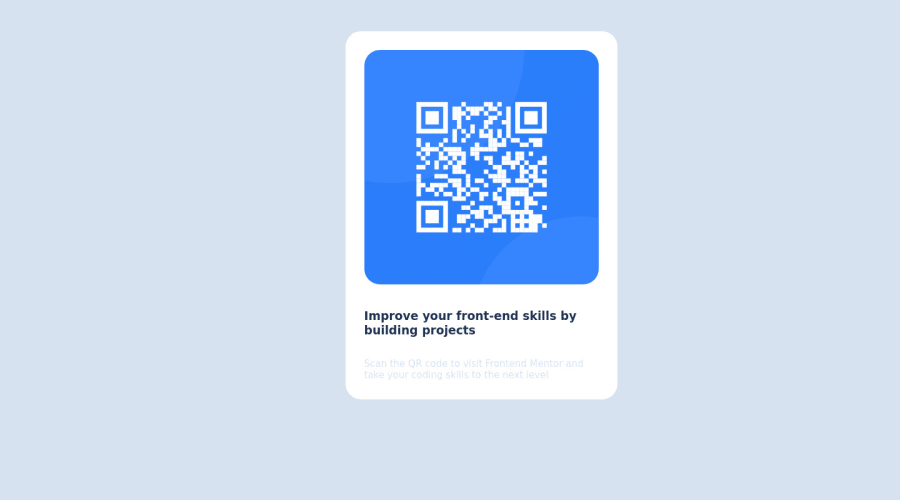
Design comparison
Solution retrospective
give me your opinion and tips
Community feedback
- @KylesTech95Posted about 2 years ago
Hi KT,
Great job on this project! I truly appreciate the use of flexbox for creating the preview card. Although your CSS look sharp, there is always room for improvement.
Issues:
- I noticed that you included a media screen at the bottom of your styles sheet. I tweaked the width just to get the width of each element to line up as close as the design:
@media screen and (min-width:1140px) { .card{ /*width: 375px;*/ /*reducing the width will alow each element to line up just like how its places in the design*/ width: 250px; } }- The [body] selector has been modified to adjust the image to the center, as well as included the font & text-align properties. Doing this will reduce the amount of lines used for each element.
body{ min-height: 100vh; background-color:hsl(212, 45%, 89%); /* width: 100vw;*/ display: flex; /*addeed flex direction column*/ flex-direction: column; justify-content: center; align-items: center; /*margin: 50px*/ /*font-fproperties & text-align can be added to reduce the line space*/ font-family: 'Outfit', sans-serif; font-size: 15px; text-align: center; }- Selectors not selected
/* text & p did not have the class "." in front of it.*/ .img, .text, .p { width: max-content; /*Not necessary because the content will adjust to the width of its parent [.card]*/ text-align: center;} /*in addition, you can eliminate these class selectors and paste the text-align property in the [body] selector*/- The paragraph text has been modified for text visibility as well as eliminating properties. In addition, the :root selector would be an effective tool to use to quickly change colors, fonts and sizes from the selector itself verses each individual element.
.p {
    /*color: hsl(212, 45%, 89%);*/
    /*Paragraph Color that can easily be seen*/
    color: hsl(220, 15%, 55%);
   /* font-size: 15px;*/
    padding-top: 1em;
    /*font-family: 'Outfit', sans-serif;*/
}
Root Example:
:root {
  --bg-color: hsl(1, 1%, 100%);
  --bg-color2: hsl(212, 45%, 89%);
  --background-color3: hsl(218, 44%, 22%);
  --paragraph-color: hsl(220, 15%, 55%);
  --font-family:'Outfit', sans-serif;
  /*Weights 400 & 700*/
}
I hope this helps!
0 - @correlucasPosted about 2 years ago
👾Hello KT, congratulations for your first solution! 👋 Welcome to the Frontend Mentor Coding Community!
Your solution seems great, but you've a little issue with the alignment.
You tried to align the component using
marginsandposition relativebut this make this task really tricky and hard control all the content. My advice for you is to useflexboxto create this alignment. First thing you've to do is to addmin-height: 100vhto make sure your body will be displaying minimum 100% of the view-port height (this will help the card be ever aligned vertically centered) and then adddisplay: flex; align-items: center; justify-content: center;to make the alignment.Something that can be a time saver for you is to use a CSS RESET to remove all default settings for margins, making the images easier to work, see the article below where you can copy and paste this css code cheatsheet: https://piccalil.li/blog/a-modern-css-reset/
✌️ I hope this helps you and happy coding!
0
Please log in to post a comment
Log in with GitHubJoin our Discord community
Join thousands of Frontend Mentor community members taking the challenges, sharing resources, helping each other, and chatting about all things front-end!
Join our Discord
