Responsiveness with media queries and flexbox


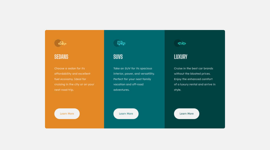
Design comparison

Community feedback
- @IamparvesPosted almost 3 years ago
Hello @Yahyaabbakar92,
Your design looks good but I don't understand why did you code the same thing twice for device larger than 1400px and smaller than 400px. What about the device between them? And that's not how responsive design works. Please look around more if you don't have clear understanding of responsive design.
And one more thing, there is a little issue with the "Learn More" button hover effect. It moves a little because of border. You should use the border for default state too. That will solve the issue.
Marked as helpful0@Yahyaabbakar92Posted almost 3 years ago@Iamparves Thanks for taking a look at my code. I'm still learning my way around responsive design and I'll definitely take your advice and reapply it later. Thanks
0

Please log in to post a comment
Log in with GitHub
Join our Discord community
Join thousands of Frontend Mentor community members taking the challenges, sharing resources, helping each other, and chatting about all things front-end!
Join our Discord