Design comparison
Solution retrospective
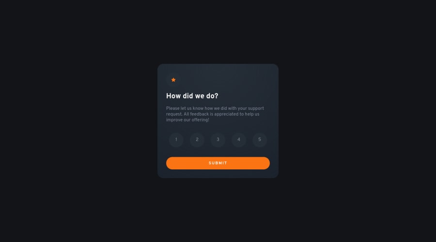
I found doing the background difficult as I've never used radial-gradient before.
Community feedback
- @hyrongennikePosted about 2 years ago
Hi @Mark-a-obrien,
Congrats on finishing the challenge. Just a small user experience related tip try and avoid using the browser alert box for validation message even if you add a simple message or do nothing when the submit button is click and no rating number was selected that would improve the UX.
As for gradients you can use the below CSS gradient generator for future challenges (https://coolors.co/gradient-maker/eeb86d-9946b2)
Marked as helpful0@Mark-a-obrienPosted about 2 years ago@hyrongennike Hello Hyron,
Thank you very much for the feedback. That link will definitely come in handy :). Yeah I was a little lazy putting in the alert box. I'm planning on changing it later.
All the best
Mark
1
Please log in to post a comment
Log in with GitHubJoin our Discord community
Join thousands of Frontend Mentor community members taking the challenges, sharing resources, helping each other, and chatting about all things front-end!
Join our Discord
