

Design comparison

Community feedback
- @correlucasPosted about 2 years ago
👾Hello @Mohamed33362, Congratulations on completing this challenge!
Your solution its almost done and I’ve some tips to help you to improve it:
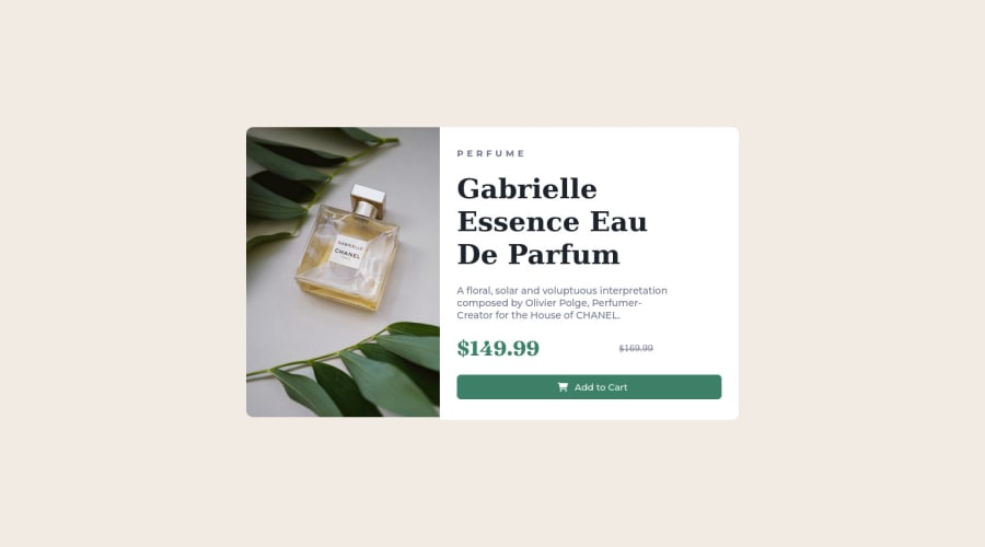
Use the THE PICTURE TAG that is a shortcut to deal with the multiple images in this challenge. So you can use the
<picture>tag instead of importing this as an<img>or using a div withbackground-image. Use it to place the images and make the change between mobile and desktop, instead of using adivorimgand set the change in the css withdisplay: nonewith the tag picture is more practical and easy. Note that for SEO / search engine reasons isn’t a better practice import this product image with CSS since this will make it harder to the image. Manage both images inside the<picture>tag and use the html to code to set when the images should change setting the devicemax-widthdepending of the device desktop + mobile.Check the link for the official documentation for
<picture>in W3 SCHOOLS:https://www.w3schools.com/tags/tag_picture.aspSee the example below:
<picture> <source media="(max-width:650px)" srcset="./images/image-product-mobile.jpg"> <img src="./images/image-product-desktop.jpg" alt="Gabrielle Parfum" style="width:auto;"> </picture>👨💻Here's my solution for this challenge if you wants to see how I build it: https://www.frontendmentor.io/solutions/product-preview-card-vanilla-css-and-custom-hover-state-on-hero-dVGWpOTgWS
✌️ I hope this helps you and happy coding!
1 - @VCaramesPosted about 2 years ago
Hey there! 👋 Here are some suggestions to help improve your code:
-
The purpose of the Main Element is to identify the main content off your page; It is not the container of you component. Inside the Main Element, you will want to create a new container and place your component inside that new container.
-
The image’s “Alt Tag” description needs to be improved upon to better describe what they is. You will want to assume that you are describing the image to a someone.
-
This component requires the use of two images 🎑 at different breakpoints. The Picture Element will facilitate this.
Here is an example of how it works: EXAMPLE
Syntax:
  <picture>
    <source media="(min-width: )" srcset="">
    <img src="" alt="">
  </picture>
More Info:
https://www.w3schools.com/html/html_images_picture.asp
https://web.dev/learn/design/picture-element/
- Currently, the old price (169.99) 🏷 is not being properly announced to screen readers. To fix this, inside the Del Element you will want to add a Span Element with an sr-only class that will state something like “The previous price was…” and use CSS to make it only visible to screen readers.
If you have any questions or need further clarification, feel free to reach out to me.
Happy Coding! 🍂🦃
0 -


Please log in to post a comment
Log in with GitHub
Join our Discord community
Join thousands of Frontend Mentor community members taking the challenges, sharing resources, helping each other, and chatting about all things front-end!
Join our Discord