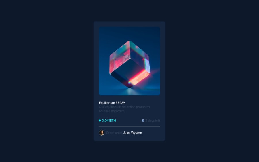
Design comparison
SolutionDesign
Solution retrospective
!
Community feedback
- @denieldenPosted over 2 years ago
Hi Abbos, great work on this challenge! 😉
Here are a few tips for improve your code:
- You can add the effect
:hovercreating adivthat appears on hover. I used tailwind but you can still see and understand which css properties you can use to do the same. Look here -> my solution - use
h1for the title of card and improve the Accessibility - add descriptive text in the
altattribute of the image - to make it look as close to the design as possible fix the
colorof text - instead of using
pxuse relative units of measurement likerem-> read here
Overall you did well 😁 Hope this help!
0 - You can add the effect
Please log in to post a comment
Log in with GitHubJoin our Discord community
Join thousands of Frontend Mentor community members taking the challenges, sharing resources, helping each other, and chatting about all things front-end!
Join our Discord
