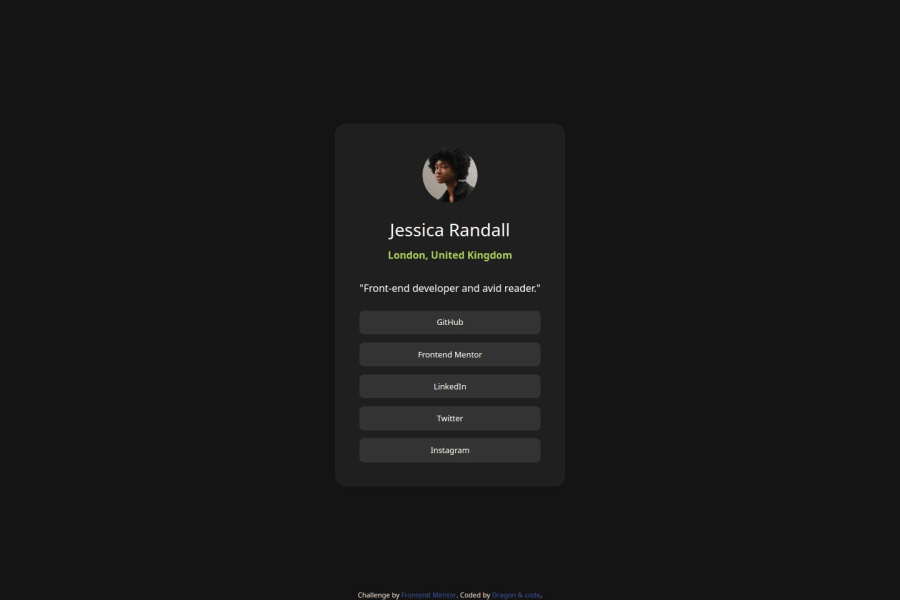
Design comparison
Solution retrospective
hi i use resposive and variable font + give smoth animation to resposive title and link + hover animation on avatar img
What challenges did you encounter, and how did you overcome them?to took alot of time learn variable font and use animation this but this satisfyed ilike result
What specific areas of your project would you like help with?analysis the project spets and Structuring + clean coding and some tip to faster coding becus im slow as hell tnxxx ^_^ have a nice day
Community feedback
- @luizfbnPosted 6 months ago
Nice solution! I found some things you can improve:
About HTML:
- You used a lot of divs, this is not wrong but you could use semantic HTML. For example, for list links you can use <ul> and <li> tags;
- There's no need to wrap a div inside a div like you did on class "container" and "main-menu". There's no difference between them.
About CSS:
- Links should be in a higher font weight;
- On link card hover, it should be background green and font color grey. You can check it on active state image, inside design folder;
- Try to keep it responsive (on small screens the card breaks);
- On style.css there are some empty classes;
- There are repeated style about attribution class in CSS file and HTML;
Good job and keep studying! :)
0
Please log in to post a comment
Log in with GitHubJoin our Discord community
Join thousands of Frontend Mentor community members taking the challenges, sharing resources, helping each other, and chatting about all things front-end!
Join our Discord
