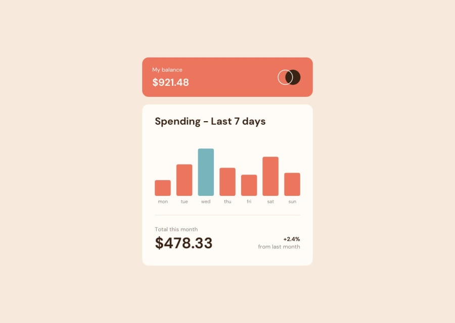
Design comparison
SolutionDesign
Community feedback
- @denieldenPosted about 2 years ago
Hello Kritika, You have done a good work! 😁
Some little tips to improve your code:
- use
min-height: 100vhto body instead ofheight, otherwise the content is cut off when the browser height is less than the content - add
transitionon the element with hover effect - Using
<hr>for the line is not the best way because this tag have a semantic meaning... in this case use div withborder-bottombecause this line is decorative - use
p or h1 h2 h3for the text and price instead of adiv
Keep learning how to code with your amazing solutions to challenges.
Hope this help 😉 and Happy coding!
Marked as helpful1 - use
Please log in to post a comment
Log in with GitHubJoin our Discord community
Join thousands of Frontend Mentor community members taking the challenges, sharing resources, helping each other, and chatting about all things front-end!
Join our Discord
