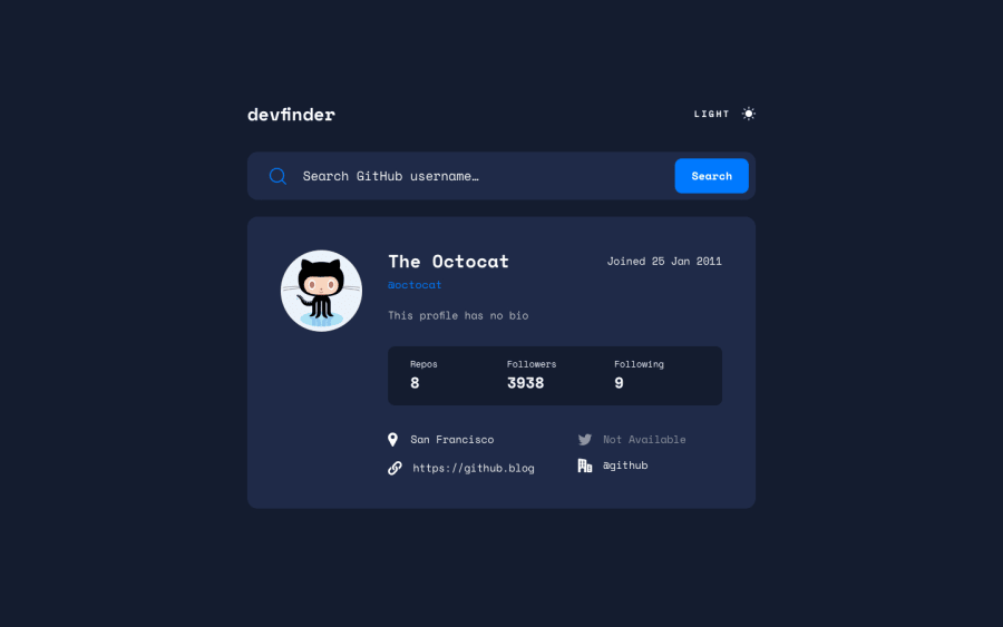
Design comparison
SolutionDesign
Community feedback
- @ormus395Posted about 2 years ago
Hello,
First off, great job completing the challenge! It doesn't load properly in the preview, but it does in the site. And it looks great.
One thing however, is I would use a css class instead of loading a new stylesheet for the dark mode, that way your aren't making another call the server. Additionally, if you aren't going to use a form, I would listen for the enter button, as it would make this more accessible to those that may not be able to use a mouse to click the button to search.
Overall good job!
Marked as helpful0
Please log in to post a comment
Log in with GitHubJoin our Discord community
Join thousands of Frontend Mentor community members taking the challenges, sharing resources, helping each other, and chatting about all things front-end!
Join our Discord
