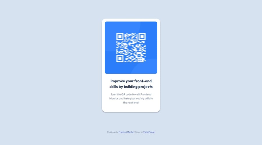
Design comparison
SolutionDesign
Solution retrospective
What are you most proud of, and what would you do differently next time?
I learnt basics of figma designs and it was very helpful how the properties helped me build this project ASAP.
What challenges did you encounter, and how did you overcome them?I was facing issue initially using the Figma but I was able to create a issue in help channel and was able to solve with people help.
What specific areas of your project would you like help with?I need few inputs regarding these:
- I want help in checking I have added the heading thing in p tag should I use any specific tags for bold point?
- I have not added any media query as the card size is very small that is 320px and do we need to add some margin for the below screen size of 375px?
- Please review my class naming convention and html schema
- How to check the font size in the Figma file? I tried searching it but it was not helpful
Community feedback
Please log in to post a comment
Log in with GitHubJoin our Discord community
Join thousands of Frontend Mentor community members taking the challenges, sharing resources, helping each other, and chatting about all things front-end!
Join our Discord
