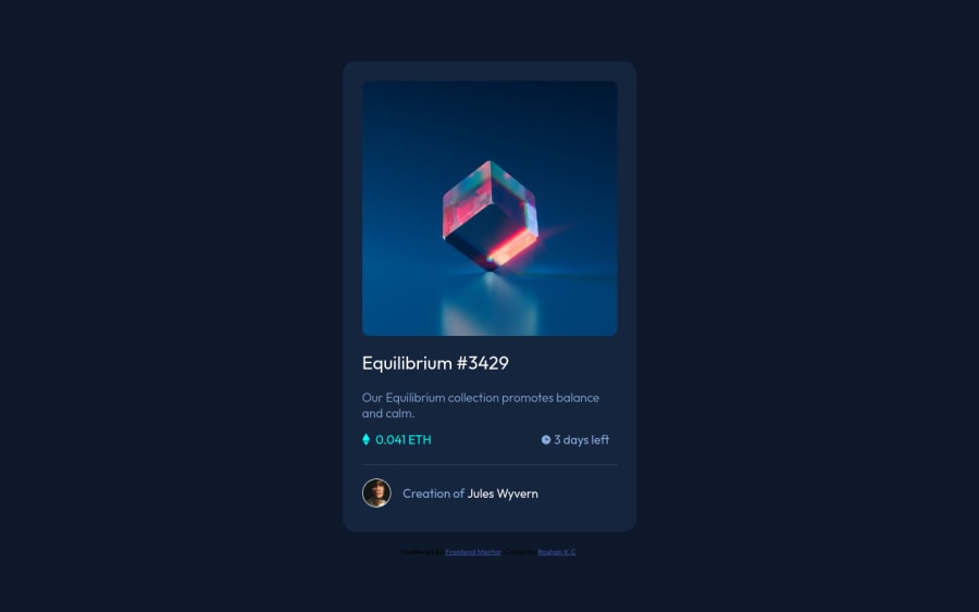
Design comparison
Community feedback
- @PhoenixDev22Posted almost 3 years ago
Hello @roshankcpkr,
I have some suggestions regarding your solution:
-
First of all , I would suggest to have a separate file for the styles.
-
There should be two landmark components as children of the body element - a
main(which will be the NFT card ) and afooter(which will be the attribution).<Footer>should be in the<main >read more about A simplified web page, might look something like this:- Anything with a hover style in a design means it's interactive. you need to add an interactive element
<a>around the imageEquilibrium #3429, Jules Wyvern.
- Anything with a hover style in a design means it's interactive. you need to add an interactive element
-
For any decorative images, each img tag should have empty
alt=""andaria-hidden="true"attributes to make all web assistive technologies such as screen reader ignore those images in(icon-view, icon-ethereum, icon-clock). -
the avatar 's alt shouldn't be
profile picit's meaningless , you can set toJules Wyvern. Also , the main image alt needs to be changed -
the link should be wrapping the original image and either have
Sr-onlytext, anaria-labeloralttext that says where that link takes you. -
You can use an unordered list
<ul>to wrapclass="two-content"and in each<li>, there would be<img >and<p>(to wrap the text ). Then you can use flexbox properties to align them centrally. -
To center the card on the middle of the page , you can use the flexbox properties and
min-height: 100vhfor the<body>like this:
body{ display:flex; align-items: center; justify-content: center; width: 100%; /*If you set a page width, choose 100% over 100vw to avoid surprise horizontal scrollbars. */ min-height: 100vh;-
I recommend to use
emandremunits .Bothemandremare flexible, Usingpxwon't allow the user to control the font size based on their needs. -
Never use
pxfor font size. -
width: 375px;an explicit width is not a good way . Remove the width from the main component and change it tomax widthinstead. That will let it shrink a little when it needs to.Removewidth: 90%;
Overall, your solution is good, Hopefully this feedback helps.
0 -
Please log in to post a comment
Log in with GitHubJoin our Discord community
Join thousands of Frontend Mentor community members taking the challenges, sharing resources, helping each other, and chatting about all things front-end!
Join our Discord
