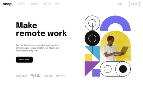
Submitted over 3 years agoA solution to the Intro section with dropdown navigation challenge
Flex only solution.
sass/scss
@brainwins

Solution retrospective
Still trying to find the best way to break my resolutions for mobile and such.
I believe I could clean up my CSS a lot. Too many selectors.
I'm using mostly rem's and vw's. But I'd like to have more consistent rules on when to use which.
All feedback welcome!
Code
Loading...
Please log in to post a comment
Log in with GitHubCommunity feedback
No feedback yet. Be the first to give feedback on brainwins's solution.
Join our Discord community
Join thousands of Frontend Mentor community members taking the challenges, sharing resources, helping each other, and chatting about all things front-end!
Join our Discord