Not Found
Not Found
Not Found
Not Found
Not Found
Not Found
Not Found
Not Found
Not Found
Not Found
Not Found
Not Found
Not Found
Not Found
Not Found
Not Found
Not Found
Not Found
Not Found
Not Found

Submitted

flex, inset, pseudo element

Benjaminā€¢ 130

@Benjoow

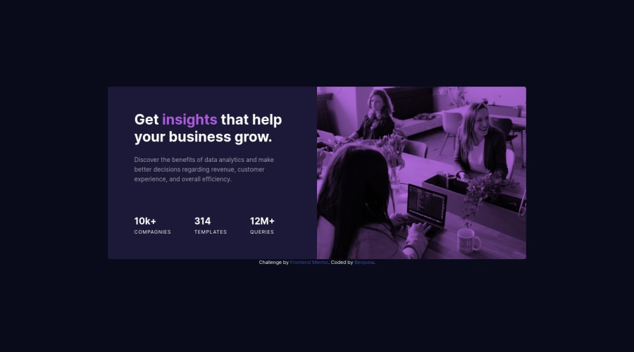
Desktop design screenshot for the Stats preview card component coding challenge

This is a solution for...

  • HTML
  • CSS
1newbie
View challenge

Design comparison


SolutionDesign

Solution retrospective


I use fixe padding maybe i should use clamp or more dynamic unity ? For my next try !

Community feedback

Vanza Setiaā€¢ 27,795

@vanzasetia

Posted

Hello, Benjamin! šŸ‘‹

Congratulations on finishing this challenge! šŸŽ‰ Your solution looks pretty good! šŸ˜€

Regarding your question, in this case, you don't need any "dynamic" value. However, it really depends on what you are trying to achieve. Usually, clamp() function is used for dynamic font size. For example:

body {
  /* clamp(minimum, preferred, maximum) */
  font-size: clamp(1rem, -0.875rem + 8.333vw, 3.5rem);
}

Now, two things that can be fixed.

  • First, I recommend re-positioning the attribution because on mobile view, both landscape and portrait, the attribution is on the top of the card element. So, my recommendation is to not use absolute positioning to position the attribution.
  • Second, there should not be text in span and div alone; instead wrap the text with a meaningful element. In this case, I recommend using ul and li instead of the div for the bullets section.

That's it! Hope you find this useful! šŸ˜

Marked as helpful

0

Benjaminā€¢ 130

@Benjoow

Posted

@vanzasetia

Thank you for your advice ! I use clamp for my font size with a combinaison of rem for my font clamp et em for my padding. I don't know if it's good practice but it works :-)

About your points, I will change my span use and replace by ul and li even if it's not a semanticaly a list.

Thank you for taking your time to answer me !

0
Vanza Setiaā€¢ 27,795

@vanzasetia

Posted

@Benjoow You're welcome! If you want to know whether or not it should be a list or a heading, you can see the site without any styling and think of it as a document file. In my opinion, it's a list because without the styling it would look something like this.

  • 10k+ companies
  • 314 templates
  • 12M+ queries

Marked as helpful

0
Benjaminā€¢ 130

@Benjoow

Posted

@vanzasetia

It's very clear now ! I will remember to visualise the site without styling and are more focus on semantic, thank you Vanza ! :)

Oh and how can you implement your code window inside your message ?

0
Vanza Setiaā€¢ 27,795

@vanzasetia

Posted

@Benjoow Glad to know that! šŸ˜„

This textarea supports markdown syntax. You can see all the possible syntax by clicking the keyboard icon (it's above textarea, on the top right corner of the textarea).

1
Shashree Samuelā€¢ 9,260

@shashreesamuel

Posted

Hey good job completing this challenge

Keep up the good work

Your solution looks great however I think that the opacity on the card image needs to be increased in order to achieve the effect as seen in the design.

In terms of accessibility issues simply wrap all the content between your body element in main tags

I hope this helps

Cheers

Happy coding šŸ‘

1

Benjaminā€¢ 130

@Benjoow

Posted

@TheCoderGuru

I try many opacity in my card image but it's not the core exercice (layout) for my. I don't want to take too long looking for the right settings.

Why i need to wrap all my stuff inside my main tag ?

0
Shashree Samuelā€¢ 9,260

@shashreesamuel

Posted

When you wrap all your content within the body element between the semantic main tags then it is distinguishable against the rest of the document and gets rids of the issue "Document must have one main landmark"

I hope this clarifies

1
Vanza Setiaā€¢ 27,795

@vanzasetia

Posted

@Benjoow It's important for all the page content to live inside a landmark element so, that browsers, screen readers, and even search engine bots understand what the page content is for.

Also, screen reader users can navigate through any website using landmarks. This is useful because if the header contains a lot of navigation links then those users can just skip to the main content by jumping from the header directly to the main element. This way, they don't have to listen to all the links in the header.

0
Benjaminā€¢ 130

@Benjoow

Posted

@TheCoderGuru

But in this exercice i have just one main tag with another div element below. I don't understand exactly the issue. Perhaps you refer to attribution div ? If is it the case, that's not my HTML but the standard HTML inside the project and...ok, i didn't change it :-).

Thank you anyway for your comment and your time ! That's very kind

0

Please log in to post a comment

Log in with GitHub
Discord logo

Join our Discord community

Join thousands of Frontend Mentor community members taking the challenges, sharing resources, helping each other, and chatting about all things front-end!

Join our Discord