Design comparison
Solution retrospective
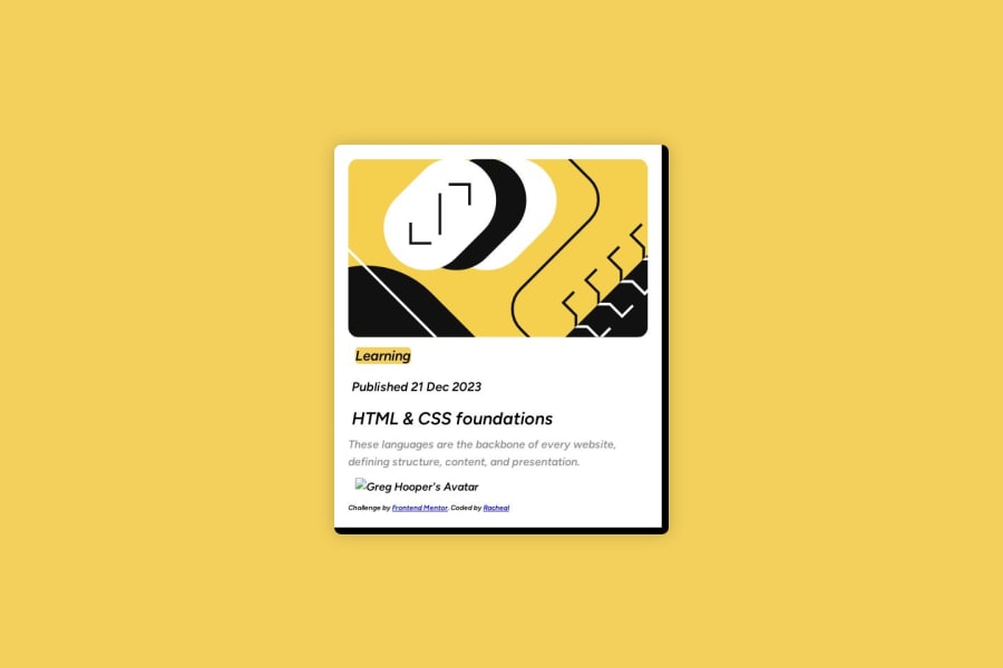
What I found difficult was linking the image. I have always had an issue with this; I know how to find a link and add it, but I have never had success when the image is on my own computer. Centering the card on the canvas proved challenging. I am unsure about the font and the background color in the learning process. I would appreciate any helpful feedback. What am I doing wrong, and how can I improve?
Community feedback
- @MelvinAguilarPosted 11 months ago
Hello there 👋. Good job on completing the challenge !
I have some suggestions about your code that might interest you.
-
Firstly, use the
<img>tag to display an image. Depending on the location of the.htmlfile, you should write the path to the image. Here are some concepts:Note: You can find more information by searching "relative path on html" on Google.
-
To display an image in the same folder as your
index.htmlfile, simply use./followed by the image name.
<img src="./my-image-in-the-same-folder" alt="">-
To display an image inside a folder, use
./followed by the folder name and the image name separated by "/"
<img src="./my-folder-name/my-image-in-the-a-nested-folder" alt="">- Never use the entire path of your PC, like
C:\Users\rache\OneDrive\Desktop\codechallengs,as it won't work.
In this case, the image is named "illustration-article.svg" and is inside a folder named "images," which is within another folder named "assets."
So, if you put it all together, the path to the image would be:
<img src="./assets/images/illustration-article.svg" alt=""> <img alt="Greg Hooper's Avatar" src="./assets/images/image-avatar.webp"> -
I hope you find it useful! 😄 Above all, the solution you submitted is great!
Happy coding!
Marked as helpful0 -
- @seanbucklePosted 11 months ago
Limit the number of
<div>tags you use.Try to use more semantic ones, such as
<header> <nav> <main> <article> <section> <footer>It will make it a lot easier to read the code not only for you, but also the browser.
See link: https://www.w3schools.com/html/html5_semantic_elements.asp
Try this for the image:
<img src="./assets/images/image-avatar.webp" alt="Greg Hooper's Avatar">When it comes to centring in this particular case when using grid just use the following:
display: grid;
place-items: center;
For font, look at this link: https://developer.mozilla.org/en-US/docs/Web/CSS/font
To make font and colour values reusable consider using CSS variables.
See link: https://developer.mozilla.org/en-US/docs/Web/CSS/Using_CSS_custom_properties
Possible layout:
body{
display: grid;
grid-template-rows: 1fr auto;
}
<body> <main> <article class="card"> //card contents <article> </main> <footer class="attribution"> </footer> </body>Links on layouts and grid see below:
Marked as helpful0
Please log in to post a comment
Log in with GitHubJoin our Discord community
Join thousands of Frontend Mentor community members taking the challenges, sharing resources, helping each other, and chatting about all things front-end!
Join our Discord
