Submitted over 1 year agoA solution to the Four card feature section challenge
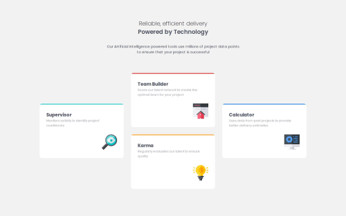
Four card feature section flex, grid, sass

P
@yoyov51234
Solution retrospective
What are you most proud of, and what would you do differently next time?
1, I finished this project after 3 days.... I didn't give up. 2, I have a deeper understanding of the rank of the classes
What challenges did you encounter, and how did you overcome them?In the end , I made the 1440 view using a grid, but the grid-gap is fixed, but when the screen goes larger, the vertical gaps between the divs are no longer the same.
What specific areas of your project would you like help with?For the minimal size, how to define it's minimal enough and the cards shouldn't shrink anymore?
Code
Loading...
Please log in to post a comment
Log in with GitHubCommunity feedback
No feedback yet. Be the first to give feedback on yoyov51234's solution.
Join our Discord community
Join thousands of Frontend Mentor community members taking the challenges, sharing resources, helping each other, and chatting about all things front-end!
Join our Discord