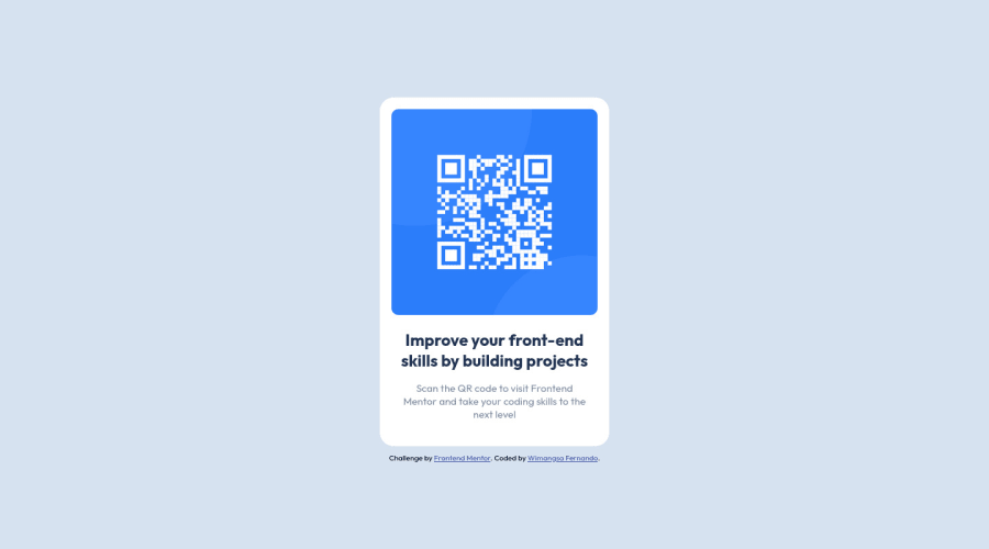
Design comparison
Solution retrospective
-
Do I have another way to center the card without using flex?
-
Did I overdid assigning classes to HTML properties?
-
Did I miss something in the design?
I welcome feedback apart from these questions as well. Thank you in advance.
Community feedback
- @ajeetachalPosted over 1 year ago
"Great job on using the flex property to create a visually appealing and responsive QR code component. The layout looks professional and well-organized. Well done!"
Yes, there are other ways to center a card without using flex. Here are a few options:
(1) Using text-align: center If the card is a block-level element, you can use the text-align property to center its contents horizontally. Set the parent container's text-align property to center, and the card's contents will be centered within the container. However, this will only center the contents horizontally and not vertically.
(2) Using margin: auto You can center a block-level element using the margin property. Set the left and right margins to auto, and the element will be centered horizontally within its parent container. Again, this will only center the element horizontally and not vertically.
(3) Using absolute positioning You can position the card absolutely and center it using the top, left, bottom, and right properties. Set the parent container's position property to relative, and the card's position property to absolute. Then set the top, left, bottom, and right properties to 0, and the card will be centered both horizontally and vertically within the container.
Note that these methods may have different effects on the layout and positioning
Marked as helpful2 - @Bader-IdrisPosted over 1 year ago
You can set the container in the middle of the screen whatever user changes it when you add these properties to it in CSS:
.container { position: absolute; top:50%; left: 50%; transform: translate(-50%, -50%); }
the new feature is transform, it has many lovely properties you can discover, I personally love it. Hope it's useful
Marked as helpful1 - @Meraj-Sharif-KhanPosted over 1 year ago
To center the card Use
display:grid;
andplace-items:center;
and usemin-height:100vh
instead ofheight:100vh
for your container class, That way container will grow with content otherwise it will remain 100vh (100% of viewport height)..container { min-height: 100vh; display: grid; place-items: center; }
Marked as helpful1 - @MelvinAguilarPosted over 1 year ago
Hello there ๐. Good job on completing the challenge !
In general, the solution is excellent. You have correctly written the alt attribute of the image and the style of the code is consistent and very well-organized. Regarding your question, I have 2 small suggestions:
CSS ๐จ:
-
Yes, there are other ways to center the card without using flex. One way is to use the grid layout:
.container { display: grid; place-content: center; min-height: 100vh; }
You can read more about centering in CSS here ๐.
- Noteโ ๏ธ: Use
min-height: 100vh
instead ofheight
. Setting the height to 100vh may result in the component being cut off on smaller screens, such as a mobile phone in landscape orientation.
- Noteโ ๏ธ: You can also use
position: relative
, but using it in this type of component is a bad idea because it will clip it on mobile devices.
- Noteโ ๏ธ: Use
CSS Reset ๐:
-
Currently, you have a vertical scrollbar, which is due to the default margin that some browsers apply to the body element. To remove it and avoid problems in future challenges, I recommend starting to use a CSS reset.
A CSS reset is a set of CSS rules that are applied to a webpage in order to remove the default styling of different browsers.
CSS resets that are widely used:
I hope you find it useful! ๐ Above all, the solution you submitted is great!
Happy coding!
Marked as helpful1 -
- @kanishkasubashPosted over 1 year ago
Hi Nipuni ๐. Great work on completing the challenge !
In answer to your question, flexbox is generally the best modern layout method to use for flexible responsive structures. Grid would be used for content where you want better control of their layout using columns and rows. This article explains it quite well Source as well as this video by Kevin Powell which demonstrates in practice when you would use which Source (NB. You can also combine them in an application, it all depends on the use-case)
Another small things
- The <main> element should wrap around the entire component. Use semantic elements such as <main> and <footer> to improve accessibility and organization of your page.
- Make sure to always locally host your fonts for privacy and performance reasons. Here's another good video which shows how to practically do this Source.
I hope you find this helpful! Keep up the great work! ๐
๐ฅ๏ธHappy coding!
0
Please log in to post a comment
Log in with GitHubJoin our Discord community
Join thousands of Frontend Mentor community members taking the challenges, sharing resources, helping each other, and chatting about all things front-end!
Join our Discord