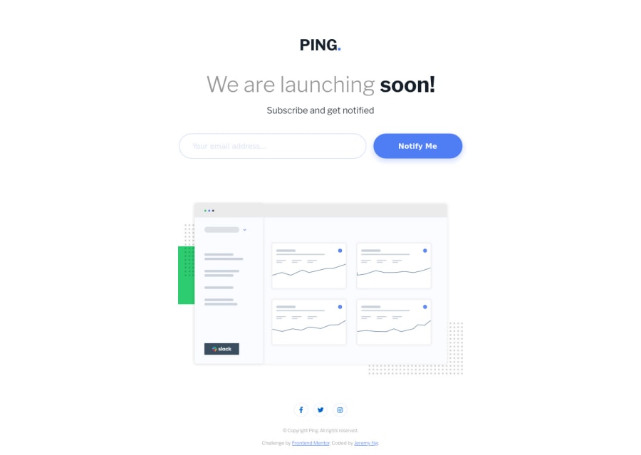
Design comparison
Solution retrospective
Hi all, thanks for checking this out!
At first I tried using Ionicons for the icons but the logos seems to only come in one flavor (e.g. the facebook icon only comes filled in a circle design with the "f" hollowed out) and I ended up reverting back to font awesome.
Because this project had a lot of white space I made the spacing around the image flexible with space-between so if there's more vertical space available, the footer will act like it's fixed to the bottom and the image will center itself between the header and the footer. If I wanted to spend more time on this I would take this a step further and make the spacing below the email form and the spacing above the socials flexible as well except for a small margin so that they're not touching each other to reduce on the white space.
Community feedback
- @tedikoPosted over 3 years ago
Hello, Jeremy Ng! 👋 Good job on this challenge! Your solution responds good. What I can suggest is:
- Since your
.illustration
image is decorative youralt
text should be provided empty (alt="") so that they can be ignored by assistive technologies, such as screen readers. - Add
:focus
pseudo class to interactive elements like anchors, buttons etc. Useoutline
property to make your website more accessible to keyboard users. - For your
.header-1
element you can useh1-h6
tag instead of div. Before you ask - yes, you can still have this span in heading tag.
Good luck with that, have fun coding! 💪
1@lanechangerPosted over 3 years ago@tediko Thanks for stopping by tediko!
I have changed .header-1's tag to <h1> and removed the string from .illustration's alt property.
However, what should I be doing with :focus and the outline properties? I went to see your solution but didn't find it there, can you point me to an example? I also looked up some articles that describes them, it seems forms, buttons, and anchors can already be tabbed through and an outline will be applied by default so not sure if there is some best practice that I'm missing here.
Also, I noticed you use aria-label and aria-hidden properties. Do you have a good resource for learning accessibility and aria properties in general that you recommend? Thanks!
0@tedikoPosted over 3 years ago@lanechanger Yes, you're right. Focusable elements like anchor, buttons or inputs they have applied default
:focus
pseudo class withoutline
property. These default styles are subtle and hardly visible tho. Furthermore every browser has a slightly different default style for the outline, so you probably want to change the default style. In your case there is simple layout, white background and focusable elements are literally in front of user face but let's suppose that project is bigger, there is more focusable elements and some of them will be hard to notice when user navigate via keyboard. Take look at this project and tab through whole page and you'll see the difference. Read more about why we should change focus styles. The outline property was just a hint, you can disable outline and for example change background of element on focus state - it depends on you. I just wanted to point out a point.1@tedikoPosted over 3 years ago@lanechanger I almost forget about second question. I was following this article in order to achive this more accessible nav menu. Have a good day!
1 - Since your
Please log in to post a comment
Log in with GitHubJoin our Discord community
Join thousands of Frontend Mentor community members taking the challenges, sharing resources, helping each other, and chatting about all things front-end!
Join our Discord