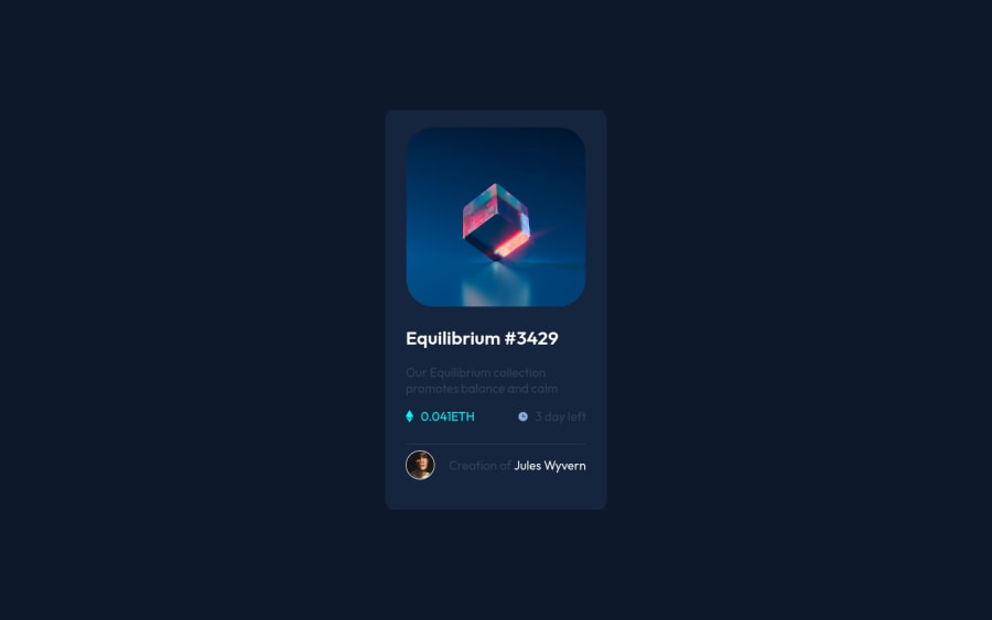
Design comparison
SolutionDesign
Community feedback
- @denieldenPosted about 2 years ago
Hi Ali, congratulations on completing the challenge, great job! 😁
Some little tips for optimizing your code:
- you can use
articletag instead of a simpledivto the container card for improve the Accessibility - centering a
divwithabsolutepositioning is now deprecated, it uses modern css likeflexbox or grid - use flexbox to the body to center the card. Read here -> best flex guide
- after, add
min-height: 100vhto body because Flexbox aligns child items to the size of the parent container - add
transitionon the element with hover effect - instead of using
pxuse relative units of measurement likerem-> read here
Hope this help! Happy coding 😉
0@yishak621Posted about 2 years ago@denielden hi bro how can i deploy my site free git and netlify is not working for me
1@denieldenPosted about 2 years ago@yishak621 now I come to see in your profile if I can help you :)
0@Ali503-7Posted about 2 years ago@denielden thanks, daniel for your valuable advice hope to see your comments on my following challenges
1@Ali503-7Posted about 2 years ago@yishak621 hi man well I'm using GitHub to host my Challenges https://youtu.be/DqjPr7auwdY This video may be useful
1@denieldenPosted about 2 years ago@Ali503-7 Sure! You are welcome and keep it up :)
0 - you can use
Please log in to post a comment
Log in with GitHubJoin our Discord community
Join thousands of Frontend Mentor community members taking the challenges, sharing resources, helping each other, and chatting about all things front-end!
Join our Discord
