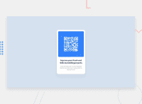
Design comparison
Solution retrospective
This was my first time working in HTML and CSS
Community feedback
- @MelvinAguilarPosted over 1 year ago
Hello there 👋. Good job on completing the challenge !
I have some suggestions about your code that might interest you.
HTML 🏷️:
- Wrap the page's whole main content in the
<main>tag.
CSS 🎨:
- You don't need to add
font-family: "Outfit", sans-serif;to each<p>,<h*>separately. Instead, add it to body.
- Instead of using pixels in font-size, use relative units like
emorrem. The font-size in absolute units like pixels does not scale with the user's browser settings. Resource 📘.
- Use
min-height: 100vhinstead ofheight. Setting the height to 100vh may result in the component being cut off on smaller screens, such as a mobile phone in landscape orientation.
- Do not use
overflow-y: hiddenon the body element, this will prevent scrolling on some devices.
-
You should use a CSS reset. A CSS reset is a set of CSS rules that are applied to a webpage in order to remove the default styling of different browsers.
Currently the body element has a margin of 8px which generates a scrollbar on desktop devices. That is the main reason why you used
overflow-y: hidden, to remove those scrollbars, but using that property will block scrolling on some devices ⚠️.A CSS reset will eliminate that margin and all default styles.
CSS resets that are widely used:
I hope you find it useful! 😄 Above all, the solution you submitted is great!
Happy coding!
Marked as helpful1@EleneDzneladzePosted over 1 year ago@MelvinAguilar Thank you so much for your feedback. I surely will keep in mind all your suggestions for future projects. Offtopic, I love your profile picture.😄❤
0 - Wrap the page's whole main content in the
- @VCaramesPosted over 1 year ago
Hey there! 👋 Here are some suggestions to help improve your code:
- ⚠️ Always use
variablesfor you colors. As it help keep things organized and easier to maintain.
More Info: 📚
- Change ⚠️
widthtomax-widthin your component’s container to make it responsive.
- Change ⚠️
widthtomax-width: 100%in your image to make it responsive.
- This properties are not needed ❌:
div {
  display: flex;
  justify-content: center;
  align-items: center;
  flex-direction: column;
  flex-wrap: wrap;
}
If you have any questions or need further clarification, feel free to reach out to me.
Happy Coding! 🤖
Marked as helpful0@EleneDzneladzePosted over 1 year ago@vcarames Thank you for your feedback! I have a question, when I change the image width to max-width: 100% it changes to its original size which is bigger than the div, that's why I had it with a fixed number.
1@VCaramesPosted over 1 year ago@EleneDzneladze
The image shouldn’t be able to go beyond the parent container, unless there is something else that needs adjustment on your code.
Here’s a link to my code to help you:
https://github.com/Valentine-D3V/QR-Card/blob/main/style.css
Marked as helpful0 - ⚠️ Always use
- @HassiaiPosted over 1 year ago
Replace the div <div> with the main tag to fix the accessibility issues. click here for more on web-accessibility and semantic html
To center the div on the page using flexbox, replace the height in the body with min-height: 100vh.
Use the colors that were given in the styleguide.md found in the zip folder you downloaded.
Use relative units like rem or em as unit for the padding, margin, width values and preferably rem for the font-size values, instead of using px which is an absolute unit. For more on CSS units Click here
Hope am helpful.
Well done for completing this challenge. HAPPY CODING
Marked as helpful0
Please log in to post a comment
Log in with GitHubJoin our Discord community
Join thousands of Frontend Mentor community members taking the challenges, sharing resources, helping each other, and chatting about all things front-end!
Join our Discord

