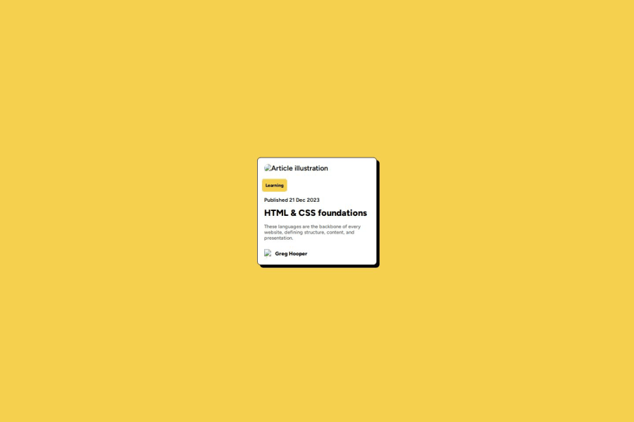
Design comparison
SolutionDesign
Solution retrospective
What are you most proud of, and what would you do differently next time?
found it easy for the most part
What challenges did you encounter, and how did you overcome them?i couldn't line the label up with the side of the image properly. if i added a container i probably could've done it.
What specific areas of your project would you like help with?using h1, p tags will adjust my margins a bit. i was originally just using a div. i should use the proper tags and just adjust the margins they use.
Why aren't my images showing on the github pages website - but when i press show live server on vs code, they do?
Community feedback
Please log in to post a comment
Log in with GitHubJoin our Discord community
Join thousands of Frontend Mentor community members taking the challenges, sharing resources, helping each other, and chatting about all things front-end!
Join our Discord
