

Design comparison

Solution retrospective
Proud of: I am most proud of successfully centering the QR code component using Flexbox. It was a challenging task to ensure that the component was perfectly centered both vertically and horizontally within the viewport. By experimenting with various Flexbox properties and margin settings, I was able to achieve a clean, centered layout that looks great on different screen sizes.
Do differently next time: Next time, I would focus on improving my understanding of CSS Grid in addition to Flexbox. While Flexbox worked well for this project, CSS Grid could offer more flexibility and control for more complex layouts. I would also invest more time in refining the responsiveness of the design, ensuring that it not only looks good on different devices but also maintains optimal performance.
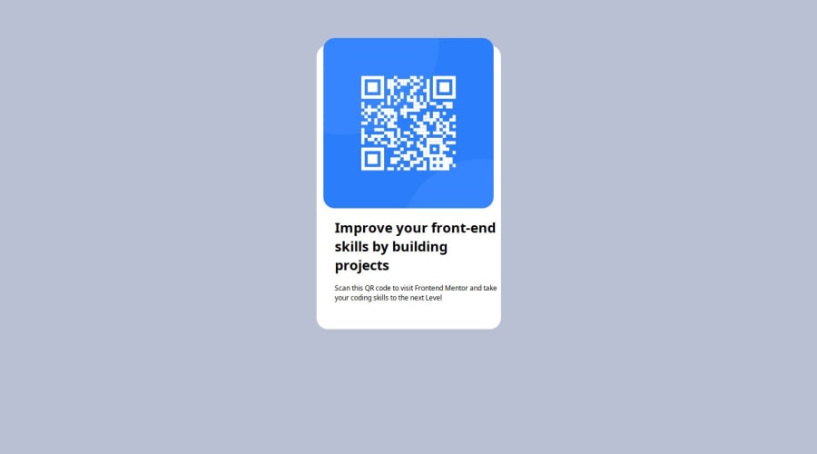
What challenges did you encounter, and how did you overcome them?One of the main challenges I encountered was centering the QR code component along with its accompanying text. Initially, I used a single main div to center everything, but this approach inadvertently centered both the image and text together, which wasn't the desired outcome.
To overcome this, I realized that separating the image and text into different div elements would give me better control over their individual alignment. I then used a main div to apply Flexbox properties, ensuring that the overall container was centered within the viewport. By nesting the individual div elements for the image and text within this main div, I could apply specific styling and alignment rules to each part independently. This allowed me to achieve a more precise and visually appealing layout.
What specific areas of your project would you like help with?I would like help with optimizing the centering techniques using Flexbox. While I managed to center the QR code component and its accompanying text, it took a lot of trial and error to get it right. I believe there might be more efficient or effective ways to achieve the same result.
Additionally, I would appreciate guidance on improving the responsiveness of the design. Ensuring that the layout looks great on various screen sizes and devices is always a challenge, and any tips on best practices for responsive design using Flexbox would be incredibly helpful.
Community feedback
Please log in to post a comment
Log in with GitHub
Join our Discord community
Join thousands of Frontend Mentor community members taking the challenges, sharing resources, helping each other, and chatting about all things front-end!
Join our Discord