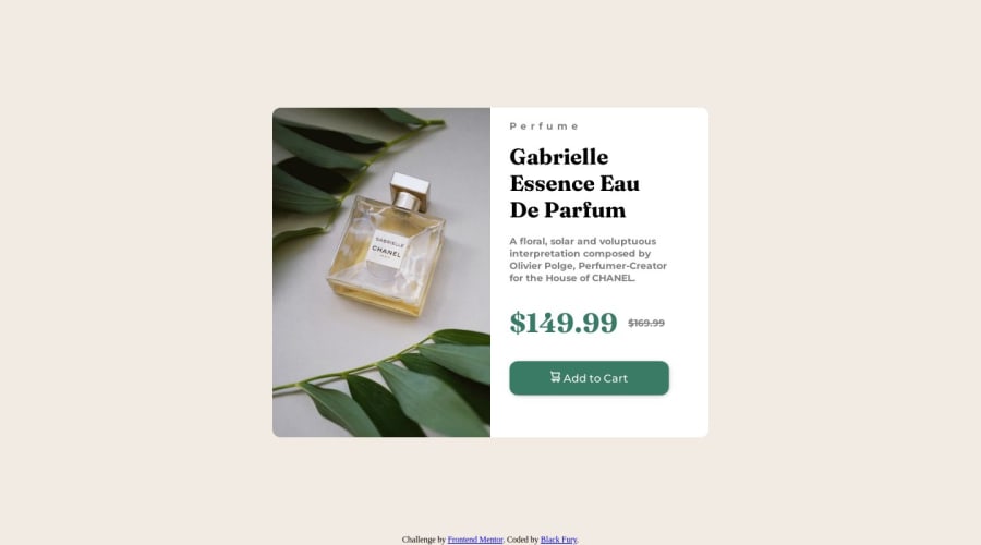
Design comparison
Community feedback
- @Munsif-AliPosted almost 2 years ago
although the design is looking good i would like to mention something
- The image’s alt tag description needs to be improved upon ⚠️. Assume that you are describing the image to someone over the phone.
More Info:📚
- This component requires the use of two images 🎑 at different breakpoints ⚠️. The picture element will facilitate this.
Here is how it looks like implemented: EXAMPLE
Syntax:
<picture>
  <source media="(min-width: )" srcset="">
<img src="" alt="">
</picture>
More Info:📚
- The old price (169.99) 🏷 is not being properly announced 😢 to screen readers. To fix this, you are going to wrap the the price in a s element and inside it you will add a span element with an visually-hidden class that will state something like “The previous price was…” and use CSS to make it only visible to screen readers.
The Strikethrough Element
Change ⚠️ the height to min-height in your body element, to improve your component's responsiveness and remove the width: 100vw; as is not needed.
ALWAYS Implement a "Mobile First" approach 📱 > 🖥Mobile devices are now the dominant 👑 way in which people browse the web. So when building your content, you will start building with small screen sizes (starting at 320px) and work your way to larger screens using min-width.
More Info: 📚
If you have any questions or need further clarification, you can always check out my submission and/or feel free to reach out to me.
you can reach me here
Happy Coding! 👾
0@id-dev3Posted almost 2 years ago@Munsif-Ali Thanks for your feedback, I really appreciate that, and I will try to fix all of this.
0
Please log in to post a comment
Log in with GitHubJoin our Discord community
Join thousands of Frontend Mentor community members taking the challenges, sharing resources, helping each other, and chatting about all things front-end!
Join our Discord
