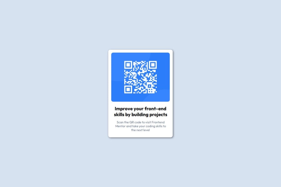
Design comparison
SolutionDesign
Solution retrospective
What are you most proud of, and what would you do differently next time?
I started the project using flex-basis, but when I added the image it didn't respect the height of its parent. So I'd rather add the background image, although I'd have to be careful, since as the width decreases the image may become misaligned.
What challenges did you encounter, and how did you overcome them?The challenge I faced was making the card flexible enough as the screen width decreased. I solved this by adapting the box model.
What specific areas of your project would you like help with?Handling flex-box properties
Properties like flex-basis, flex-grow and flex-shrink are exceptional properties that help make a box flexible enough. Knowing how to handle these properties will bring excellent results when making projects.
Community feedback
Please log in to post a comment
Log in with GitHubJoin our Discord community
Join thousands of Frontend Mentor community members taking the challenges, sharing resources, helping each other, and chatting about all things front-end!
Join our Discord
