

Design comparison

Please log in to post a comment
Log in with GitHubCommunity feedback
- @xNyfPtx
Your solution is almost similar to the design, here is my feedback
Looks
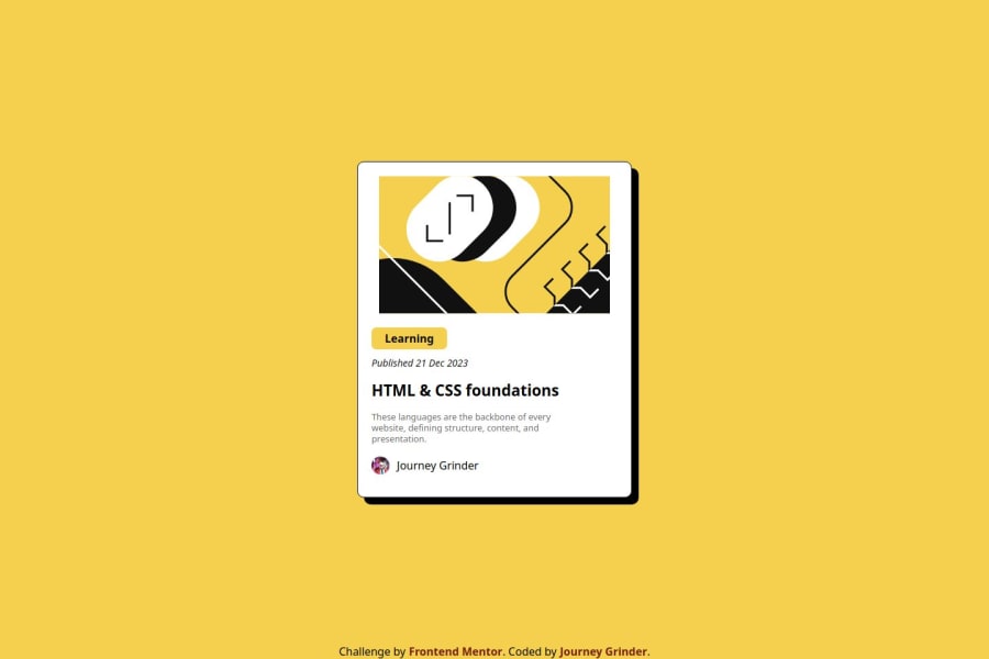
- The main image has no border radius, set one
- Set the proper fonts
HTML & Accesibility
- The main image could be better if you don't use inline svg. You can still reference it using the
<img>tag. You would typically only use inline svg you want to manipulate it with other css properties such asfill.
CSS
-
Replace some of the px units with a rem instead. What rem does is that it makes it scale with the default user font size which is crucial to accesibility. You would typically use the px unit on very small stuff such as borders, outlines, shadows. This can help to decide when to use rem aswell. Also, this can be helpful aswell to decide what CSS unit you should use
-
Never set a fixed width and height. You would typicall only set a fixed width in small elements that will not shrink such as profile pictures and avatars. You will need to use max-width instead. For the height, don't set one unless its a small element aswell. The paddings, text, margins, images will likely take up the height already so there is no need and it makes your card unresponsive aswell. If you really do need to set a height, use min-height instead.
-
Use a CSS reset. Your users will thank you and so do you. It basically makes your CSS look the same in all browsers. I reccomend you use this one. You should also use this in ALL of your projects
Marked as helpful

Join our Discord community
Join thousands of Frontend Mentor community members taking the challenges, sharing resources, helping each other, and chatting about all things front-end!
Join our Discord