Design comparison
Community feedback
- @leecockcroftPosted 9 months ago
Any feedback please?
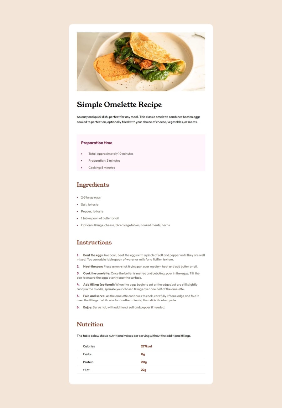
I really struggle to get this spot on in regards to margin/s and paddings. I even did it with Pixes, for example the the image div has 40px margin but the headline still isn't inline
1@Alex-Archer-IPosted 9 months ago@leecockcroft
Hi!
Your container has
padding2px for top and bottom. That why this line appears =)But I suggest you to use different layout approach at all. At first you doesn't need that much wrappers at all. That creates a lot of redundant elements. You can out all inside
maintag and use it as container.Than you can use
bodytag for centralize your content via flex. That would be easier than with margins. And applybackground-colortobodycos now your page has a white strips on the sides.As for margins and paddings, there is a one rule for more accurate using of them. Paddings are used when you need to create inner space - for example, to make button bigger, and margins - to create space between the elements. Don't use paddings for this =)
Hope that helps. Feel free to ask anything if you need =)
Marked as helpful0@leecockcroftPosted 9 months ago@Alex-Archer-I appreciate your comments thank you. I will bare that in mind for my next one! Layouts has always thrown me with css
1@Alex-Archer-IPosted 9 months ago@leecockcroft
You're welcome =)
It's a matter of practice to tune your brain to layout and css rules. You'll do it almost automatically later =)
0@leecockcroftPosted 9 months ago@Alex-Archer-I Thank you for your help.
Im playing around with this now to look at different layout approaches.
I have taken away the 1440px max with and centered the body via flex. With this approach how could I get this pixel perfect? Would I have to have the max width with a container inside the main?
1@Alex-Archer-IPosted 9 months ago@leecockcroft
Well, as I said you don't need this container at all cos you can use
mainas container, but, yes, the container should havemax-widthto keep it's width on the desktop screens and stay responsive.As for pixel perfect, I suppose that you have access to figma files. You can see all measurements there =) For now it seems you have to wide gaps between the recipe parts.
0
Please log in to post a comment
Log in with GitHubJoin our Discord community
Join thousands of Frontend Mentor community members taking the challenges, sharing resources, helping each other, and chatting about all things front-end!
Join our Discord
